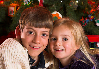
The first Christmas family portrait required balancing ambient with... ambient. This sequence of portraits required a more conventional balance of ambient and flash.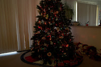 Pretty standard stuff, although I had a bit of a difficult time getting a reasonable exposure of the Christmas lights. The first task was to eliminate the light from behind the curtains. Luckily, I had a dark green tarp and some duct tape at my disposal...
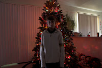 Once I blocked out the sunlight, I ended up with an exposure of approximately 1/3 sec, f/6.3, and ISO 400 to get the Christmas lights. Turns out they are a lot darker than I thought! Obviously, I used a tripod to get a relatively stable shot and a flashlight to acquire focus -- the kids didn't enjoy me shining it in their faces, but it worked. There was still some contamination from elsewhere in the house but it worked out. Honestly, I probably should have waited until night to shoot with the Christmas lights, but the kids would have been cranky then :(
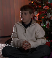 My lighting scheme was my typical cross lighting scheme; a hard light coming low to camera left and behind the 'model' and a soft light to upper camera right. In the shots above and to the left I was attempting to balance the Christmas lights with the backlight. I had too problems: first, the low ambient and large aperture required me to go 1/16 power on my SB-20, which was still way too bright. So I put two layers of office paper on the flash to cut down the output by a stop or two. I also had to control the spill onto the tree and the floor (you can see the floor problem above) so I put a box on the floor behind the flash to gobo the tree and laid an old shirt on the floor in front of the flash to gobo the floor. Sorry, I should have taken a setup shot but I didn't. If you want more gobo info, check out Strobist's description.
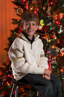 The final ingredient was the soft light source, or a Sunpak 383 at 1/4 power into an umbrella. I did the shot with two kids early in the shoot, and had the right light balance. But I missed the light balance on the individuals and had the key light about a stop too low (or, alternatively, the ambient a stop too high). The result was my kids looked washed out and pale like the image at left. Enter post processing...
I had to do more post processing than I'd like, but it wasn't too bad. One big issue was the bright neon green ornament right behind my son's head. That was cloned out. Then I darkened the background, brightened his face, applied a light vignette, and dodged and burned where appropriate (especially in the upper left corner). I also did a bit of work on the shadow from the backlight (one argument for placing it above the floor). The result is below; not perfect, but pretty good other than the shadow problem.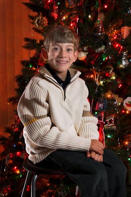
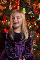 My daughter's shot was similar, and required a bunch of post processing too (including cloning out a bit of hair that was going right down her face over her eye). The biggest improvement was when I took the picture though: positioning. When I had her sit down she naturally sat really square to the camera and the images were looking pretty crappy. Once I asked her to rotate her body and face the camera, the images looked 100% better. Top advice I can give to amateurs shooting portraits: don't have your subject square to the camera! I really need to learn more positioning basics too...
Her final portrait is below: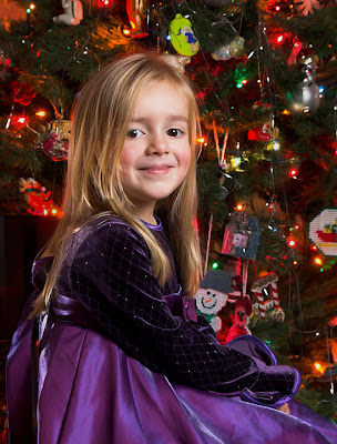
And, as before, it was a rough day for all involved... (not really, this is just how she makes faces -- kinda scary, right?)
Friday, December 7, 2007
AoaP: Family Pic #2, In Front of the Christmas Tree
Posted by Sean at 9:28 PM
Labels: Anatomy of a Photo, Portraits
Subscribe to:
Post Comments (Atom)


No comments:
Post a Comment