 Yesterday I grabbed my camera and took a bike ride to the bay near Shoreline Amphitheater. To be more specific, I took the Steven's Creek trail in Mountain View (see the City of Mountain View site for more information including a map). My goal was just to get some exercise and find something interesting to take some pictures of.
The good news was that it was cloudy and the sky wasn't a boring blue. The bad news was that it was cloudy and cold. And the other good news was that I found plenty of birds for pictures.
The first bird I encountered while riding out to the bay on Steven's Creek Trail. If you don't know the trail, it is a relatively narrow path at the top of a large embankment (dike?) with office parks and a tree farm storage area on one side and a small stream with a dirt path beside it on the other. As I was riding, I saw a large white bird in the stream so I went down to check it out.
It turned out to be a Snowy Egret. During my first approach, it got scared and flew 20 yards up stream, but in that area, there was a bank with long grass between the path and the stream, so I was able to creep up without disturbing it. That was how I got the image that started this post (as always, click the images to see them larger).
Then, this kid rode up with his family near behind and spooked the bird. They eventually took off the direction they came because they weren't able to cross the runoff that was joining the stream at that point, but the damage was done.  At least I got a decent shot when the egret took off (honestly, I'm amazed that my camera locked focus in time for the shot). Of course, that's the Canon USM for you on my Canon 70-200mm F/4 USM, which isn't really a birding lens, but works pretty well for the large birds.
A bit further down, I climbed up the embankment and gathered my stuff to continue once more when I realized I had just walked by a rather large bird sitting in a tree. It was this guy: So, back down the hill to check it out... Originally I thought it was a Great Blue Heron, although it seemed a little strange to be sitting in a tree and I don't remember GBHs having red eyes. For the record, I only boosted the saturation on the image -- the eyes really are that crimson. Turns out, it isn't a GBH, it is a Black-Crowned Night Heron, a nocturnal bird of genus Nycticorax. BCNHs are pretty common in this area and they roost in groups during the day and eat at night, making a sound loud cawing sound like a crow. I think I finally solved the puzzle of these birds!
After that, I moved on, although I encountered another Snowy Egret at a distance -- with white plumage they stick out like a sore thumb in the drab bay marshes. So I grabbed this shot which I'll leave you with:
Monday, December 31, 2007
Snowy Egrets and Black-Crowned Night Herons
Thursday, December 27, 2007
Holiday Pictures with Bounce (Flash)

Man, I wish I had actually read Strobist on Monday. The Christmas Day game plan is brilliant! But of course, I read about it today instead of when it can actually do me some good.
In case you don't know, the game plan I refer to is to set up two strobes the night before to give nice lighting in the early morning hours of Christmas Day. Essentially, it is a cross-lighting technique using bounced light in two corners of the room, giving you uniform lighting and the independence to shoot anywhere. Of course, the results post gives more details of the lighting set-up, examples, and description.
Me, I just used standard old bounce flash... on camera (for shame!).
If wedding photographers have been using it forever, I suppose it can't be all bad.
Bounce Flash Basics
The basic gist of bounce flash is shown in the amazing diagram I drew in PSP below. Includes color! (and yes, I am available to draw stick figures for pay) Aim the flash head up at the ceiling to produce a large area of diffuse light (just like an umbrella or soft-box). That light then illuminates the entire scene. To change the location of the light, just change the angle of the flash.
 For instance, in the image at left, I had it aimed too far forward, causing a bright spot on the ceiling behind the tree. Oops :) Even then, note that the huge light fire-hose that is a Sunpak 383 manages to get enough light on my kids to see their expressions. As usual, all the images in this post can be clicked on to see them larger.
 When I adjusted the flash to aim directly above me, it produced the image at right. This is the down side of bounce flash... Since there is only one light source, you're pretty much always going to have light drop-off somewhere in the image. Typically, closer objects will be brighter, so it is advantageous make the closest object in the frame your subject.
Using a Bounce Card
In the diagram, the red object on the flash is a bounce card to produce a catch light in the subjects' eyes. If you don't know, a bounce card is attached to the back of the flash (away from the subject) to reflect a little bit of light very brightly toward the subject. While I don't have any close-ups to show you the idea, you can get the point from the near 100% crop of my wife and daughter below. Notice they both have bright spots in their eyes to give them a twinkle and an added bit of life.
If you look at the light from the point of view of the subject you'll see a bright spot from the bounce card. Which, I actually did thanks to my wife, because we needed to document me opening my mother-in-law's present. To really see the light distribution from the subject's perspective, check out the reflection in the (fingerprint covered) TV:
Bright, small light right at the camera, and a large diffuse light from the ceiling bounce.
My Experiences
My first session was Christmas Eve when a friend's family came for dinner (sadly, they're leaving the area, and we just dropped them at the airport yesterday). They have four kids who are really good friends with our kids, and I wanted to get some candids of them playing to help them remember each other. So, slap the ol' Sunpak 383 on the camera, pop it into manual, spend a minute or two monkeying with settings, then try to get some candid shots before my kids cover their faces (apparently, they've been my subjects way too many times).
I'm not going to post any of these shots though, because I didn't get permission to stick them on the web.
The second session was Christmas morning and I used what I learned the night before to get a lot more keepers, like the image that opened this post. So what did I learn?
- Shoot RAW. Since I could boost or decrease the exposure up to three stops in each direction, I didn't need to nail exposure each time (more info on shooting RAW). Very useful since I was moving around the house and each room gave slightly exposure values.
- Don't skimp on power. Groups of children will rarely stay in the same plane (willingly, at least). As a result, I used an aperture of F/8 most of the time requiring at least half-power on the Sunpak at ISO 200.
- Keep the ISO low. As tempting as it is to use a higher ISO and use less flash, I found I needed to boost the brightness a lot in post processing. After all, overexposing could blow highlights, while underexposing is easier to recover from. Boosting exposure is essentially raising the ISO, so start with a lower ISO to keep noise manageable.
- Use a bounce card. My bounce card was a white(ish) post-it my wife had written someone's number on, rubber banded to the flash head. Cheap, but it worked great.
- Remember to change the flash direction when you do portrait oriented shots. This was actually a big annoyance, and one of the reasons the fixed crosslighting method is superior if you know you'll be working in a single room. Often, I saw a pleasing composition in portrait orientation, but by the time I swiveled the flash the subjects had already run away to put on more princess dresses. Of course, if you have white walls, you can just bounce it off the wall (although the lighting will come from a different direction).
- Make sure you have white ceilings :)
Sunday, December 23, 2007
The Shot: Finale

Don't worry, no spoilers on the finale here unless you haven't seen the earlier shows.
I just wanted to go on record with my prediction that Maria will win. While she doesn't have the technicals down completely yet, the technicals are pretty easy to learn. Interacting with models and clients isn't, and she's got that in spades.
Dean has too much arrogance. I can't imagine a company would want him representing them.
And John is just... not as talented, I guess. He gets nervous and flustered too easily.
So, Maria is my prediction. Now to watch and see who wins!
I know, I know, I'm getting way too far into this stupid reality show. For the record, I do really enjoy the analysis of the images. The pause button on my DVR is super-useful because it lets me come up with my own critique before I hear everyone elses!
Friday, December 21, 2007
PSA: Beware the Duct Tape
Public Service Announcement:
Do not use duct tape to attach anything to your flash. The adhesive won't come off, even after an hour of use, and ruin the aesthetics of your flash.
As an aside, turns out duck tape is just an early (military) name for duct tape. Gaffer's tape is basically duc(t/k) tape with a matte surface to avoid reflections and a less sticky adhesive which won't leave any residue. So use that for your flashes (I still need to get my hands on some).
Some duct tape info (and alternate names) can be found at the Duct Tape Guys (crazy site, but worth a look).
Thursday, December 20, 2007
The Cost of Advertising
There's a very educational post up at the Photo Business News & Forum about advertising budgets and usage rights to images. Harrington's message is to know what questions to ask so you can price your quote according to the expected exposure (and rights needs) of the image(s).
Essentially, if you're a big-time (or even small-time) photog and an advertising company comes to you for a quote, they probably know exactly what the budget is even if they are evasive when you ask them about numbers. So ask them for the proposal docs (outlining the budget) and the media schedule (where the ads will run). This will both give you an idea of where your quote should be and allow you to adjust your quote upwards if the exposure will be very high for the photo.
While his point is great, I got a heck of a lot more from looking at his visual aids.
For instance, he gives an example proposal cover page, including:"We recommend a full-day shoot, in one New York City location. This will allow time for shooting photography for both the "parents centric" and the "children centric" ads in the same day, which is the most cost-effective approach. The budget for this shoot, including all photographer's fees, location scout, permit fees, stylist, and photographers rights package is $12,000-$14,000."
Yeah, there's some big money in photography. Even if the photographer gets only a quarter of that budget for her time and equipment, that's still $3-4 K for a day's work plus post.
I've had plenty of concerns about the photography industry as a whole but I see now how a mid/high end photographer can make ends meet. Sadly, it's the low end that suffers, since the industry is under attack from both directions: the consumer camera market makes do-it-yourself portraits more appealing and micro-stock allows many companies that pay a decent chunk of change for images to pay a tiny fraction of that. But that's a post for another day.
Another thing that was awesome to see was the media schedule (click here to go directly to it). For quite a while I've been curious about the costs of advertising, and the three quarters of a million dollars in this budget was quite a surprise. Wow, that's some big money (makes sense though, since ad agencies aren't known for barely making a profit).
This also relates a bit to my experiences with Google Adsense. Without giving a lot of detail ("The first rule of Adsense revenue is..."), I've been curious why some clicks get me a penny of revenue while others are 50 cents or more. How do companies make a profit with almost a dollar a click? Can they really make that money back just by someone visiting their site?
But compare those rates to the provided media schedule. Assuming the impressions figure given is per 'in', it costs around 1.9 cents each impression for in the paper, 16.5 cents for the style magazine, and 1.9 cents on the web. Think about it -- that's 1.9 cents each time the image is shown on the web -- even if nobody looks at it (or your ad blocker ignores it). So 50+ cents for an actual website visit isn't much.
There is definitely some big money in advertising, and as a result, some big money in advertising photography. Imagine the difference a great image will make in the effectiveness of a campaign vs an image that is merely o.k. A few extra thousand for a quality photographer is nothing when your overall advertising budget is nearly a million dollars!
Monday, December 17, 2007
Flash Balance: High Voltage Style

How to make your standard night time christmas tree picture:
DSLR on a tripod in long exposure mode... Check.
Flash to light up my santa clause suit... Check.
Tesla coil to light up the christmas tree... What?
From Wired's online article about Peter Terren:
Terren stands beside his holiday display. To make it, he prepared a wire structure outlining the tree and star. Since sparks tend to stay in one place, the tree can't be lit up with one big jolt. It's a gradual process, taking 91 seconds to create a completed tree. He used a manual SLR camera to record a single still picture of the entire process, and utilized filters to get the different colors.If you've spent any time with the Strobist point of view, try to figure out the process he went through. Hint: it is kind of like light painting balanced with flash, but using 100,000 volts.
The cage of sparks around the car is definitely worth a look too (slide 4)!
Sunday, December 16, 2007
Review: Sunpak Auto 383 Super Flash

I realized recently that I never did a full review of the Sunpak Super 383 Flash. I did briefly talk about it at the beginning of my Nikon SB-20 Review but I think it deserves its own page. For convenience, I'll quote some of the (updated) information here:
Popular Shoe-Mount Flashes for Off-Camera Use
The standard for low cost off-camera flash (learn to light at Strobist!) is the used SB-24 ($70+ including S/H on eBay) or the used SB-26 ($90+ including S/H on eBay). Many have written about these, so I won't spend any time on them (especially since I've never even touched one).
But, if you want to get a new flash with manual capabilities and not spend a lot, the Sunpak 383 ($80 including shipping on Amazon) and Vivitar 285HV ($95 including shipping on Amazon)are your main options. All of these have a safe sync voltage for modern digital cameras, including the Canon 350D/Digital Rebel XT. Please note the Vivitar 285 (non-HV) does not have a safe sync voltage, so don't buy a used 285 and then get mad at me because it fried your camera!
If you have $80+ to spend and some time, get an SB-24 or SB-26 on eBay. It might take a while to find a good deal on a flash in good condition, but it is an excellent way to start.
If you have $80-$90 to spend on your first flash and you want a new one (or don't want to struggle with auctions), I say get the Sunpak 383. The Vivitar 285HV is a really close second, but the swivel option on the Sunpak 383 is worth it. The swivel option gives you a lot more flexibility with stand placement, allows ceiling bounce in portrait orientation (or wall bounce in landscape), and the ability to turn the sensor to face the subject when using an umbrella.
Both the 383 and 285HV are powerful, reliable, and can take a sync cable for off-camera flash. Be warned that the Sunpak has a proprietary sync connector (an extended 2.5mm phono jack), but I've found the standard length plugs from RadioShack work if you use a rubber band to hold the plug in. The 383 also lacks a zoom function, but I don't find that to be a big problem since any time I really want to control light spill I use a snoot.
Both flashes also work in auto mode: a photocell measures the reflected light from the subject and quenches the flash when a threshold is reached based on the aperture of the camera. This allows the flash to automatically compensate for a varying distance without depending on special circuitry in the camera. Both also have manual controls (switches) and no LCD screen, but sometimes I wonder if that is a problem or an advantage.
Motivation:
What brought all this up again was a desire for a third flash (to join the SB-20 and Sunpak Auto 383 Super I already have). I've been finding that it'd be really useful to have a third flash for a background light or to add more hair light or rim light. I'm still on a tight budget (arguably tighter than before!) so I want to get the best quality for the least cost. And, naturally, it makes sense to get another Sunpak or SB-20 to let me reuse light modifiers.
If cost was no issue, I'd just get a Canon 580EX II
So, that leaves me with the Sunpak 383 or SB-20. I'll probably just nab another SB-20 off eBay (approx $30 including shipping) but first I need to figure out how to reliably snoot and reduce spill on it. Sunpak 383s go for $60+ including shipping on eBay, so I'll probably just go the new route at Amazon (see eBay widget and Amazon quote below). Although I'm a bit disappointed that the Sunpak is no longer offered directly through Amazon with free shipping, the price is still $5 cheaper than B&H.
The Sunpak is currently my go-to flash. It is always the first one I grab for, and while I love the SB-20, it isn't quite as useful (but it is half the price).
Full Review:
The 383 is just a useful flash with everything you need if you like to shoot manual. It has manual settings from full to 1/16, tilts, swivels (many other flashes don't), recycles quickly, and is durable.
Swivel: In particular, the swivel option I find super useful. The ability to pop it on my light stand and face the head towards whereever I want the light yet put the controls (and/or an optical trigger) facing another direction is great. It also makes adjusting the angle of light very easy. When you tilt or swivel it it has very nice detents that hold it at the desired angle (but be careful, it won't swivel all the way around).
The main drawback of the Vivitar 285HV is the lack of a swivel. It does add a zoom, but after using the zoom on my SB-20, I'd much prefer the swivel. You can always get the zoom functionality with a silvered snoot, but you can't add a swivel!
Below you can see the flexibility of the 383 on a light stand.

Manual Mode: While the manual controls are all ... manual, I don't really miss an LCD. Everything you need is at your fingertips when you are using it. Sometimes the switches are a bit hard to trigger move, but not too bad when you get used to them. About 98% of the time I use the flash in manual mode. The controls (with the flash in manual mode) are below -- just set the left switch to M, then set the slider to your desired power. The control panel is below.
 This is one area where the Vivitar 285HV might have an edge on the Sunpak because it has a variable power setting (meaning you can rotate it however you want). I'm not sure how important that would be -- I've never found myself wishing for 3/8 power or anything like that. I do wish it had a 1/32 and 1/64 setting -- often, especially balancing against ambient at close range, the 1/16 is still too powerful. My usual trick in that case is to cover the end of the flash with white copy paper to eat some light.
Auto Mode: Initially, the auto mode was a real selling point for me when I bought the flash. But now I never really use it, and I've never had much success with it. I don't know if it is just my flash (maybe the sensor is mis-calibrated) or what but it never seems to get the exposure right. It also may be that the area sensor in front of the flash (inside the green circle in the picture at the top of the page) covers too much or too little area. It does work, but it always seems to overexpose by a stop or two and doesn't do a good job deciding what to expose on.
If you're looking for an automatic exposure flash (for instance, wedding photography) don't get this flash. It's great in manual mode, works like a champ for off-camera lighting, but the automatic mode is mediocre at best and useless at worst.
Connectivity: A major annoyance of the Sunpak 383 is the proprietary 3mm phone jack for external sync. The Sunpak jack takes a plug about 5mm longer than standard mono plugs. This means the plug I picked up at Radio Shack and attached to my eBay wireless trigger doesn't stay in by itself... But, if I wrap a rubber band around it as shown below, it is super reliable and I never have missed trigger problems. FYI, the PC sync cable included with the 383 is a piece of crap and I had lots of trouble with it using an eBay PC adapter that goes in the camera hot shoe. That may be an indicator of the quality of the PC adapter, but you've been warned.
 Again, 98% of the time this is how I use the 383. I've also put it on the cheap eBay optical triggers and it works like a champ, or on my camera. I've never had triggering problems with it, and it is safe for low voltage hot shoes, unlike the Vivitar 285 (non-HV).
Another part of connectivity is light modifiers, and again, I have no problem attaching snoots, gels, computer paper, macro flash adapters, etc. to the 383.
Conclusion:
As far as I'm concerned, the Sunpak Auto 383 Super is the best deal out there for a new, powerful, and flexible off camera flash with manual settings. If you want to go used, you might be better off getting a flash with a zoom mode and more settings (like an SB-24 or SB-26) but for a new flash, the Sunpak can't be beat. Just make sure you get a shoe adapter or make yourself a custom sync cable.
Thursday, December 13, 2007
Anatomy of a Photo: Staring Down a Fly
 Our Hero
(all photos can be clicked to see them larger)
Above is my highest scoring DPC entry ever, What are you looking at?. Even more notable is that it got a 6.8 in a the November free study, and I was expecting about a 6. I guess DPC'ers like bugs; fly macros always seem to do super well.
Although, if you think about it, a fly is just about the perfect macro subject:
- They're all over the place. It isn't hard to find a fly on any given day, as opposed to something like a praying mantis. I haven't seen a praying mantis in decades.
- They like to hang out in one spot and are relatively docile -- I was within inches of the fly above and he just looked at me.
- They have great macro detail with large compound eyes, hairs all over their body, membranous wings, and interesting mouth parts. All at a level which we don't normally see, but is readily apparent at 1:1 or 2:1 magnification.
Getting the Shot:
He was buzzing around one morning while I was cleaning up the kitchen, so of course, I dropped the broom, grabbed my camera, and outfitted my camera with 20mm of extension tubes, my reversed Nikkor-H 50mm F/2, and my newly-made macro ringflash mounted on my Sunpak 383 in the hot shoe.
Then, I proceeded the chase the sucker around, blinding him with the flash whenever I could get a decent shot. The combination gave me approximately 2:1 magnification. It was also my first time using the macro ringflash "in the wild".
 The first place I got him (the "money shot") was when he landed on the corner of one of the plastered white walls in the kitchen (hence the moon-like texture on the white surface). The image has been rotated 90 degrees to the right, plus another few degrees to get the horizon perfectly horizontal. The shooting parameters were F/16, 1/200s, and ISO 100. I think the Sunpak 383 was at 1/4 or 1/2 power. At left is a high-res result of the file. I also posted a high-res shot on Flickr (but not as high-res as the shot at left).
I shot handheld, which ended up making focus super-difficult. The process was to depress the aperture lever on the Nikkor-H to open it up, lock my focus with the bright(er) viewfinder, then pop it back into the working aperture and take the shot without moving. At 1:1 I have no problems, but at 2:1 I had a pretty low success rate.
When I first looked through the images I actually didn't think the image was good. For one thing, I had screwed up the settings and not noticed at the time, making the image very dark. More on the extensive post-processing later. For another, I didn't get enough light on the back of the fly and I had wanted to get the wing detail.
When I looked the next day, I realized this image has a lot more punch to it than the others. While I am disappointed that I lost the wing detail, the light-dark contrast, fixed stare of the fly, and focus are dead on.
Lighting:
A few words about the lighting. Technically, I used on-camera flash since the Sunpak 383 was in the hot shoe and the macro ring flash adapter just moves the light down to the lens. But, from the fly's point of view, he was facing a 16 foot ring light about 6 feet in front of him which is about as off camera flash as you can get. Kind of makes the lighting a bit more nuanced than you might think. Also, the wall did a lot to both fill the underside of the fly yet shadow the rear part of the fly.
Yet, as nice as this shot came out, I generally feel that straight ringflash leaves macro subjects a bit flat and lifeless. The best use of the ring flash is in conjunction with backlight or side light, which I used on my later images of the fly. Remember, you can't get the donut catchlights when your subject has a compound eye!
Another thing to keep in mind, which worked to my benefit in this image, is that the light drops off very rapidly at macro distances. This causes the flash to be very bright on the front of the subject (an advantage since the ring diffuser eats so much light) yet very dark even a centimeter behind. So you need some sort of second light on your background if you don't want a black background. And ambient is really tough to work with since apertures are small and any camera shake is greatly magnified in macros. Another issue to keep in mind is any foreground items will almost always be blown out by the brightness of the flash.
My general macro scheme from now on will be to use the ring as fill and a second flash (or the sun) as a side or backlight. Ringflash only will be useful, but only if I really want to isolate the subject and darken the background.
 Post Processing:
At right, you can see what I started with. Yeah, that's dark.
Really dark.
The problem was I had the lens at a larger aperture on accident, and when I stopped down I didn't boost the flash power or the ISO. Luckily, I shot RAW (like I usually do for anything remotely tricky) so I could address the problem in RawShooter Essentials. As I've mentioned in Quick Tip #7, RAW lets you save exposure problems.
So, the first step is to adjust everything using RSE. Here is a screen-capture with my adjustments (click to see it full-size):

I used pretty much every feature:
- Color balance adjustment was minimal. The copy paper changes the color of the flash a bit (turns it slightly blue I think) but the camera doesn't have too much trouble detecting it.
- I had to use almost two stops of exposure compensation, a bunch of fill light, added shadow contrast (deepening the blacks) and removed highlight contrast (which helps to not blow out highlight detail).
- Max the saturation. Gotta have those eyes red.
- Some sharpness and detail extraction. Honestly, probably not even needed since I downsampled it anyway.
- A decent amount of noise suppression.
 The uncropped end result after RAW conversion is to the left. This has been resized and had a USM pass, but that's it. I converted into TIFF so I could continue to battle the noise and the darkness of the image in PSP XI; I probably boosted brightness almost another stop using curves.
The end result of the boosting of exposure (or pushing in film terminology) is the noise is equivalent to ISO 800. And for DPC, noise is bad. So I had to be real aggressive with noise reduction, starting in RSE, and then running two passes of noise reduction in PSP XI. In my opinion, NeatImage produces the best results and preserves the most image detail, but it doesn't work for 16-bit per pixel images. PSP XI is a relatively close second, and for whatever reason, RSE's noise reduction isn't that great, especially at higher levels.
Other than that, I did a lot of localized sharpening, cloning, and HSV. Specifically, the eyes needed even more saturation and a little brightness boost, but not as much sharpening as the legs. Oversharpening the eyes made them look really bad. There were also a lot of noise-removal artifacts on the horizon, so I deselected those areas during the second sharpening pass.Again, the high-res version (approximately 1/4 of the pixels of the original, a 50% reduction in each dimension) is at right. You can see it still doesn't have as much detail as can be represented in the pixels -- a factor of both an imperfect optical path and noise problems. Luckily, at DPC sizes (640pix) the image really pops and doesn't lack detail.
Conclusion and Bonus Image:
Overall, I'm really happy with the shot. Yeah, I'd love to get more detail and less noise, but I'm sure I'll take more pictures of flies. They really are impressive creatures that we rarely see up close.
As I mentioned earlier, I kept shooting after the DPC shot and start experimenting with the ringflash and a hard side-light to bring out details in the fly. Most of the shots aren't great, especially since the fly decided to move onto our sliding glass door and got rather active, but I have one nice one to share with you below. This was shot at 2:1 (reversed Nikkor-H with extension tubes), 1/200s, ISO 200. The angle isn't nearly as dynamic, but I love the color and detail on the back of the fly.
Enjoy!

Tuesday, December 11, 2007
Drool...
While I will never, ever own a top of the line DSLR right after it comes out, it is fun to read about them.
John Harrington over at the Photo Business News & Forum just posted a comparison/review of the Canon EOS 1Ds Mark III and Nikon D3. Unlike most reviews, he focuses more on the usability of the cameras than the stats (for indepth reviews, check out here (1Ds) or here (D3)). His consensus was "Nikon by a nose" even though on most issues (especially high-ISO noise) Nikon came out ahead. And he's planning on shooting with both...
What's it mean for the rest of us, who don't have an extra $500 laying around, let alone the $5K (Nikon) or $8K (Canon) necessary to buy one of those cameras? Not much, really, since the primary component of your images is what you put in front of the camera. Harrington's conclusion really highlights this effect -- he's pretty happy with both cameras. Even though one is 22 megapixel (Canon) and the other is only 12 megapixel!
And just because a camera is expensive, it doesn't mean it will be free of problems (like the 1D Mark III's autofocus).
Although the one thing on the top of the line cameras that I'm jealous of is the reduction in high-ISO noise. That would definitely come in handy -- I feel like I'm always banging into limitations on the amount of ambient light, so less noise and higher ISOs would be awesome. Believe it or not, Nikon goes up to 25,600 ISO with less noise than the 20D's 3200 ISO!
Edit: The D3 vs 5D noise comparison at Ken Rockwell's site is worth looking at.
Sunday, December 9, 2007
I dream of...
If you want to know one of my dreams, check out my poker blog. I've decided to dust it off for a bit while I take a shot at rebuilding my bankroll.
Probably not going to interest you though unless you are a poker addict fanatic.
Friday, December 7, 2007
AoaP: Family Pic #2, In Front of the Christmas Tree

The first Christmas family portrait required balancing ambient with... ambient. This sequence of portraits required a more conventional balance of ambient and flash. Pretty standard stuff, although I had a bit of a difficult time getting a reasonable exposure of the Christmas lights. The first task was to eliminate the light from behind the curtains. Luckily, I had a dark green tarp and some duct tape at my disposal...
 Once I blocked out the sunlight, I ended up with an exposure of approximately 1/3 sec, f/6.3, and ISO 400 to get the Christmas lights. Turns out they are a lot darker than I thought! Obviously, I used a tripod to get a relatively stable shot and a flashlight to acquire focus -- the kids didn't enjoy me shining it in their faces, but it worked. There was still some contamination from elsewhere in the house but it worked out. Honestly, I probably should have waited until night to shoot with the Christmas lights, but the kids would have been cranky then :(
 My lighting scheme was my typical cross lighting scheme; a hard light coming low to camera left and behind the 'model' and a soft light to upper camera right. In the shots above and to the left I was attempting to balance the Christmas lights with the backlight. I had too problems: first, the low ambient and large aperture required me to go 1/16 power on my SB-20, which was still way too bright. So I put two layers of office paper on the flash to cut down the output by a stop or two. I also had to control the spill onto the tree and the floor (you can see the floor problem above) so I put a box on the floor behind the flash to gobo the tree and laid an old shirt on the floor in front of the flash to gobo the floor. Sorry, I should have taken a setup shot but I didn't. If you want more gobo info, check out Strobist's description.
 The final ingredient was the soft light source, or a Sunpak 383 at 1/4 power into an umbrella. I did the shot with two kids early in the shoot, and had the right light balance. But I missed the light balance on the individuals and had the key light about a stop too low (or, alternatively, the ambient a stop too high). The result was my kids looked washed out and pale like the image at left. Enter post processing...
I had to do more post processing than I'd like, but it wasn't too bad. One big issue was the bright neon green ornament right behind my son's head. That was cloned out. Then I darkened the background, brightened his face, applied a light vignette, and dodged and burned where appropriate (especially in the upper left corner). I also did a bit of work on the shadow from the backlight (one argument for placing it above the floor). The result is below; not perfect, but pretty good other than the shadow problem.
 My daughter's shot was similar, and required a bunch of post processing too (including cloning out a bit of hair that was going right down her face over her eye). The biggest improvement was when I took the picture though: positioning. When I had her sit down she naturally sat really square to the camera and the images were looking pretty crappy. Once I asked her to rotate her body and face the camera, the images looked 100% better. Top advice I can give to amateurs shooting portraits: don't have your subject square to the camera! I really need to learn more positioning basics too...
Her final portrait is below:
And, as before, it was a rough day for all involved... (not really, this is just how she makes faces -- kinda scary, right?)
Wednesday, December 5, 2007
Is Photography Dead?

A thought-provoking Newsweek article: "Is Photography Dead?" There's also a thread on the DPC forums discussing the article and ideas.
You know, the best part about the web is the ability to look up many famous photographs, especially using Google Images. For instance, the image above from The Art of the American Snapshot 1888-1978 is referenced in the article but not shown. A quick google images search brings it up though. Likewise, if you are unfamiliar with Cindy Sherman, as I was, you can search for her images.
Also notable (from the DPC thread): Eric Baudelaire's Dreadful Details. Take the time to figure out why and how the photo was made -- you won't be disappointed.
Tuesday, December 4, 2007
AoaP: Family Pic #1, Under Christmas Lights

The day after Thanksgiving (a.k.a. Black Friday) typically means decorating for Christmas around my house. Actually, I'm being a bit unfair to my wife; she sometimes will until a few days after Thanksgiving before she really pushes to get the decorations up (she loves Christmas). Me, I'm the opposite... while I like Christmas, I hate to decorate. This year I can't complain at all though, because my wife did everything, including the lights outside.
Actually, it's funny. While I always tell my wife she's a Christmas fanatic, she is nothing compared to my aunt up in Washington (the state, not the capitol). For three or four years after I came out to California for grad school (when I was essentially a country away from the rest of my family) my Aunt and Uncle invited me up to their huge Thanksgiving festivities. I had a lot of fun every year seeing my cousins, eating more than I should, and playing soccer in the rainy northwestern weather. The only downside (or, the way I worked off the free room and board) was helping to put up their Christmas decorations the day after Thanksgiving. It was not a small task which took most of the day, because they had at least five or six Christmas trees to put up and decorate! Anyway, the day after Black Friday was Christmas photo day. We started out inside the house (which I'll talk about in another entry). Then we went out front at dusk and got a shot for our Christmas card on our front steps with the Christmas lights. More than anything, it was a waiting game: waiting until the ambient from the sky was slightly darker than the light from the Christmas lights. Obviously, I used a tripod and the camera timer to trigger the image. In the first photo, at left, the sky was way too bright leaving our faces in shadow.
 So we waited five more minutes, and improved to the image at right. Still not quite enough illumination on our faces... So we waited ten more minutes, and got the shot at the top of the page. I like how the Christmas lights create a zone of warm light around our faces. I did do a little doctoring though, adjusting the levels (curves) and putting a slight vignette on the image to darken the concrete at the bottom of the image and bring out our faces more.
We had our cards printed at Costco, but I made the mistake of not turning off color correction, and the image tricked their software, blowing out our faces a little bit and losing some detail. The end result is a bad case of red-face, but not enough to ruin the cards. Overall, I'm quite happy with the shot!
As luck would have it, Strobist justed posted Apropos to the Season which links to the How To Photograph Christmas Lights post from last season. The balancing of artificial light with skylight that Hobby describes is exactly what I did for this image, although I didn't use tungsten color balance because I didn't want our surroundings to be too cold. Instead, I'd rather have our faces a little on the warm side. In hindsight, maybe they are a bit too warm, but too late now, we've already got 150 cards printed!
Next time though, I'm going to do a test card with auto-correct on and make sure the colors are correct.
And in my next post, I'll describe the indoor shots, some of which came out really nice, and some of which came out so-so. We took a lot of shots that Saturday, and trust me, it wasn't all fun and games!
Monday, December 3, 2007
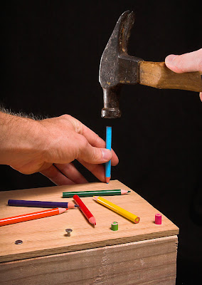
Anatomy of a Photo: Out of Nails
 This Anatomy of a Photo entry is quite delayed, but I'm usually delayed when I discuss DPC images because I don't want to run any risk of disqualification. I've got an image in the voting stages that is running a personal best, so be sure there will be an Anatomy of a Photo for it in a week.
The challenge was What is this Pencil?:
Take a photo that has a pencil as its subject. However, the pencil must be used or communicated as something other than a pencil in the photo.I was originally going to do something with pencils as chopsticks, but thank God I didn't because everyone else seemed to (and got hammered in voting because of it)! Instead, I decided to try to get across the idea of using pencils as nails since they are sharp pointy objects.
While I have no pictures of it, the hardest part of the photo was getting wood ready. After much searching of closets, I located a bunch of colored pencils that were the right size (short, like golf pencils). I'd already grabbed some wood from the scrap bin at work, so that part was easy. What wasn't easy was getting the pencils into the wood, because obviously, you can't really hammer them. I used a drill to make holes, but since a too-large hole would look fake, I had to do a lot of fiddling to get the hole diameters correct (and drill up from the bottom to make it looser). The end result was tight-fitting pencils that looked really good.
There are some key items that really make the shot pop. First, colored pencils really add an extra element to the image (I originally was thinking of yellow golf pencils, but I'm glad I couldn't find any). Leaving the extra pencils on the board was a great way to break up the space and add color too. Second, I wanted to highlight the hammer and have other nails already hammered in to get across the idea that I was only using pencils because I ran out of nails. And finally, I wanted the point of view to be as if the viewer was hammering the pencils in to draw on shared experience.
Once I had the setup right, the rest of the shoot went smoothly and I ended up with a shot very similar to what I envisioned. I have a lot of process shots from this shoot, so I'll take you through them, explaining what was changed in each shot and why. Remember, you can click on all the shots to see them larger (and click the image that started this post to see the hi-res version on Flickr).
First, the lighting, which stayed pretty similar for the whole shoot:
 I wanted soft lighting because there shouldn't be any tension or darkness in a semi-humorous image like this. So I put a Sunpak 383 (1/4 power?) into the umbrella to camera upper right, and aimed the flash even higher to get a pretty high angle, almost directly above like a shop light. In the back left, there is an SB-20 (1/16 power) aimed back towards the objects to get edge separation. Notice that I used the blanket background itself as a gobo to keep light off the rest of the background. The camera was in timer mode on a tripod to leave my hands to hold things in the shot, the Sunpak was synced with an eBay trigger, and the SB-20 was synced with an optical trigger. I shot with my 20D.
First, a test photo. Note the white background (more on the switch later).
 (Tamron 17-50mm f/2.8 @ 50mm, f/13, 1 sec, ISO 200)
Oops, the image blurred because I had it in aperture priority mode, not manual. I mess up camera settings often, but it is easy to hear a super-long exposure. Note also that I had to literally put my arms around the camera to get the right shooting angle. It wasn't too hard to keep my arms out of the frame, but sometimes the angle my arms came in at made me look a little awkward.
 (50mm, f/16, 1/250 sec, ISO 200)
Better, but I didn't like the composition. The center-right has way too much empty space in it and the lines don't lead you into the pencil. So I tried something different...
 (50mm, f/18, 1/250 sec, ISO 200)
Still not great although I like it a bit better. It'd be nice to get the second hand in there, and in this angle, I can't do it without covering the pencils. How about having the hammer come from the other side?

Nope, the shadow from my arm/hammer goes on the pencils. Not good. Back to the original idea...
 Much better. Note that I switched the SB-20 to the right side to get light on my left hand and more detail in the hammer (from the left my arm would cast a very nasty shadow).
Around this time I removed the CF card from the camera and looked at the shots on the computer. I find I can catch a lot more errors when looking on the computer, especially in the background and focus problems. I'd really like to get better at catching them on camera though, or seeing background distractions in the viewfinder before I even release the shutter.
I was pretty happy with the picture above, but there were still a few things I didn't like. First, the white background doesn't really make the colors pop. The background isn't as bright as I'd like, even though I used the SB-20 to both light the background and get some rim-light on the hammer. Also, there's writing on the hammer which is distracting. I'm needed to crop that out or cover it up somehow (in basic editing, I can't clone it).
So I decided to shoot another sequence on black and see if I could do better.
 (50mm, f/18, 1/250 sec, ISO 200)
Really makes the colors pop now. Although that white thing on the hammer is distracting. Also, note how the hammer head blends into the background. Take a second to think how you'd fix that before you look at the next image. Can you figure out the easy fix?
 (31mm, f/25, 1/250 sec, ISO 400)
Yup, move the SB-20 back to the other side, using the edge of the blanket to keep the light off the rest of the background. Also, it isn't visible in these low-res images, but the front pencils were a little out of focus, so I decreased the aperture (and increased the ISO) to get everything in focus. I also used my thumb to cover up that white paint spot on the hammer!
The one bad part about that image is my hand looks a bit strange and cramped, so shoot again...
 This was the version I ended up submitting. The one issue was my right thumb is a bit too bright and is distracting (which was commented on a few times in the challenge). So I tried again:
 But couldn't make the image look natural and ran out of time. In hindsight, maybe I should have figured out a way to cover or crop out my name on the hammer handle. Anyway, I submitted the previous, and it did well, narrowly missing an honorable mention, and gave me my third-best score on DPChallenge.
Overall, I was really pleased with how it turned out. It is a really great feeling to envision something and bring it to life exactly how I wanted it.
In the hi-res version for Flickr, I made a few of the improvements I couldn't do under Basic Editing that cleaned up the image a bit:
- Smoothed and pushed the background darker (my black blanket is textured so at hi-res it can be distracting).
- Dropped the brightness of the thumb and removed a bit of the shine.
- Some spot editing of color, cloning out a few little dots, etc.


