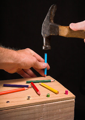
 This Anatomy of a Photo entry is quite delayed, but I'm usually delayed when I discuss DPC images because I don't want to run any risk of disqualification. I've got an image in the voting stages that is running a personal best, so be sure there will be an Anatomy of a Photo for it in a week.
The challenge was What is this Pencil?:
Take a photo that has a pencil as its subject. However, the pencil must be used or communicated as something other than a pencil in the photo.I was originally going to do something with pencils as chopsticks, but thank God I didn't because everyone else seemed to (and got hammered in voting because of it)! Instead, I decided to try to get across the idea of using pencils as nails since they are sharp pointy objects.
While I have no pictures of it, the hardest part of the photo was getting wood ready. After much searching of closets, I located a bunch of colored pencils that were the right size (short, like golf pencils). I'd already grabbed some wood from the scrap bin at work, so that part was easy. What wasn't easy was getting the pencils into the wood, because obviously, you can't really hammer them. I used a drill to make holes, but since a too-large hole would look fake, I had to do a lot of fiddling to get the hole diameters correct (and drill up from the bottom to make it looser). The end result was tight-fitting pencils that looked really good.
There are some key items that really make the shot pop. First, colored pencils really add an extra element to the image (I originally was thinking of yellow golf pencils, but I'm glad I couldn't find any). Leaving the extra pencils on the board was a great way to break up the space and add color too. Second, I wanted to highlight the hammer and have other nails already hammered in to get across the idea that I was only using pencils because I ran out of nails. And finally, I wanted the point of view to be as if the viewer was hammering the pencils in to draw on shared experience.
Once I had the setup right, the rest of the shoot went smoothly and I ended up with a shot very similar to what I envisioned. I have a lot of process shots from this shoot, so I'll take you through them, explaining what was changed in each shot and why. Remember, you can click on all the shots to see them larger (and click the image that started this post to see the hi-res version on Flickr).
First, the lighting, which stayed pretty similar for the whole shoot:
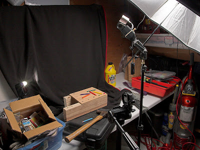 I wanted soft lighting because there shouldn't be any tension or darkness in a semi-humorous image like this. So I put a Sunpak 383 (1/4 power?) into the umbrella to camera upper right, and aimed the flash even higher to get a pretty high angle, almost directly above like a shop light. In the back left, there is an SB-20 (1/16 power) aimed back towards the objects to get edge separation. Notice that I used the blanket background itself as a gobo to keep light off the rest of the background. The camera was in timer mode on a tripod to leave my hands to hold things in the shot, the Sunpak was synced with an eBay trigger, and the SB-20 was synced with an optical trigger. I shot with my 20D.
First, a test photo. Note the white background (more on the switch later).
Oops, the image blurred because I had it in aperture priority mode, not manual. I mess up camera settings often, but it is easy to hear a super-long exposure. Note also that I had to literally put my arms around the camera to get the right shooting angle. It wasn't too hard to keep my arms out of the frame, but sometimes the angle my arms came in at made me look a little awkward.
Better, but I didn't like the composition. The center-right has way too much empty space in it and the lines don't lead you into the pencil. So I tried something different...
Still not great although I like it a bit better. It'd be nice to get the second hand in there, and in this angle, I can't do it without covering the pencils. How about having the hammer come from the other side?
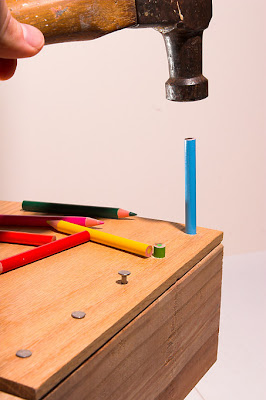
Nope, the shadow from my arm/hammer goes on the pencils. Not good. Back to the original idea...
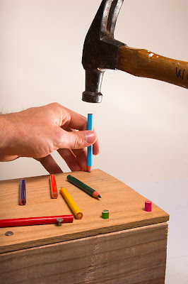 Much better. Note that I switched the SB-20 to the right side to get light on my left hand and more detail in the hammer (from the left my arm would cast a very nasty shadow).
Around this time I removed the CF card from the camera and looked at the shots on the computer. I find I can catch a lot more errors when looking on the computer, especially in the background and focus problems. I'd really like to get better at catching them on camera though, or seeing background distractions in the viewfinder before I even release the shutter.
I was pretty happy with the picture above, but there were still a few things I didn't like. First, the white background doesn't really make the colors pop. The background isn't as bright as I'd like, even though I used the SB-20 to both light the background and get some rim-light on the hammer. Also, there's writing on the hammer which is distracting. I'm needed to crop that out or cover it up somehow (in basic editing, I can't clone it).
So I decided to shoot another sequence on black and see if I could do better.
Really makes the colors pop now. Although that white thing on the hammer is distracting. Also, note how the hammer head blends into the background. Take a second to think how you'd fix that before you look at the next image. Can you figure out the easy fix?
Yup, move the SB-20 back to the other side, using the edge of the blanket to keep the light off the rest of the background. Also, it isn't visible in these low-res images, but the front pencils were a little out of focus, so I decreased the aperture (and increased the ISO) to get everything in focus. I also used my thumb to cover up that white paint spot on the hammer!
The one bad part about that image is my hand looks a bit strange and cramped, so shoot again...
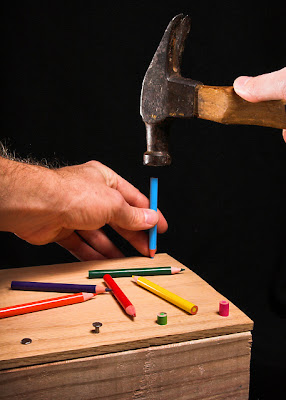 This was the version I ended up submitting. The one issue was my right thumb is a bit too bright and is distracting (which was commented on a few times in the challenge). So I tried again:
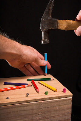 But couldn't make the image look natural and ran out of time. In hindsight, maybe I should have figured out a way to cover or crop out my name on the hammer handle. Anyway, I submitted the previous, and it did well, narrowly missing an honorable mention, and gave me my third-best score on DPChallenge.
Overall, I was really pleased with how it turned out. It is a really great feeling to envision something and bring it to life exactly how I wanted it.
In the hi-res version for Flickr, I made a few of the improvements I couldn't do under Basic Editing that cleaned up the image a bit:
- Smoothed and pushed the background darker (my black blanket is textured so at hi-res it can be distracting).
- Dropped the brightness of the thumb and removed a bit of the shine.
- Some spot editing of color, cloning out a few little dots, etc.


No comments:
Post a Comment