Showing posts with label Anatomy of a Photo. Show all posts

Friday, March 13, 2009

Anatomy of a Photo: Haptic Device


I have a spare half-hour to post so I'll go ahead and get this up, finally. The images have been ready for quite a while, but I just haven't pulled the trigger on writing the text up.

Of course, it has been a long time since I wrote an Anatomy of a Photo post. Sadly, I have no set-up shots, didn't make a note of settings, and took the shots a month ago. I'll do my best though!

* * * * *

Word has gotten out around the lab that I dabble in photography, so a number of guys have asked me to take shots of various robots and robot related apparatuses. So far, I've done at least four different shoots, not including my own robot. I have to admit, I enjoy product/technical photography -- it is fun to have a subject that doesn't wiggle, complain, need breaks, and looks cool!

While I don't consider myself a professional product photographer, I feel like I am doing a pretty good job on these shots. In fact, one of my dissertation readers commented: "Your object photos are amazing - did you hire a photographer?" Too bad it is so hard to make money in product photography in this economy!

Anyway, in this case, a guy from the lab asked if I could shoot his haptic device. I liked the way the shoot turned out (the image at the top was used in one of his presentations) so I asked him if he minded if I posted about it here. He didn't, so here we go...

* * * * *

The primary goal was to get some shots that he could use for papers and presentations, highlight the use of his haptic device, and get a few detail shots. Actually, he didn't tell me those needs outright, but whenever I do research/product shots, I always try to get a cool 'overall' view, a cool 'in use' view, and then 'detail' views based on specific contributions.

In particular, I always ask: "What is the most novel thing about this robot?" In this case, his cable transmission was notable, so I made sure to get a shot of it. Actually, the transmission shot was my favorite of the shoot -- see it at the end of this post. And, as always, click to see any of the photos larger.

* * * * *

The shoot itself occurred in a nearby conference room and was rather painless. The conference room has large brown tables that tend to look nice with a black background, so I set the robot on a table and set up some lights. Before engaging flash though, I shot a few with available light (window) for safety. Overall, I found the available light shots unremarkable so I didn't post any here.


At the start, I was undecided if I wanted a light or dark background. Often, in research papers or on the web, a white or gray background flows better (and doesn't kill printer ink). So I shot the device on a large piece of white seamless to start, as above.

The only lighting in this case is a Sunpak 383 into an umbrella at camera left. I had a large piece of foam core as fill on the other side, if I remember correctly.

After shooting a few frames and chimping, I decided the white background was not letting the device 'pop' like it should. I usually don't like white with silvery products because there is not a lot of separation between the silver and the white. So I removed the seamless and shot on the bare table:


While I liked this a little better in terms of contrast, the edges of the motors were getting lost in the background. So I decided to use a hard light from behind the object to highlight edges (again, this is the cross-lighting trick I always tend to go back to). That necessitated a swap from the umbrella to a large white wall at camera right (moving the table to get the right angle). I also added an SB-20 in deep camera left, slightly below the level of the table, to get a backlight without too much specular on the table.


Overall, I like this shot a lot better. Note how the back light evens out the table and provides a nice outline on the edges of the motors. The table itself was brought up quite a bit by the change in lighting. In particular, the key is now farther away but much larger, resulting in less drop-off.

Once I got the shot locked in, I took a series of shots in this position, moving the robot to get the specular highlights where I wanted them. In these cases, I don't mind if small portions blow out, but I want to avoid a large area (like a pulley face) completely blowing out. I also brought in a hand model when it was too hard for me to hold the device and shoot at the right angle. I could have used a tripod, but it is always easier with an extra hand! The end result was the image that opened the post.

* * * * *

One thing I've been trying to work on lately is more variation in my shots, especially for product-style photography like this. I'll do a full shoot, then realize during processing that almost all of my shots are from the same point of view. Only after the fact will I think of other unique angles or lighting setups.

So after I got a number of safe (but quality) shots, I started to experiment a little bit. The first change was to rotate the device the opposite way, using the same setup:


With the pulleys facing the key light I also took the opportunity to get some detail shots, like the shot below:


I should also mention, in terms of detail shots, you can often get away with some aggressive cropping of overall shots for web display or within a paper or thesis. It is still nice to break out the macro lens to do a few on purpose in high-res, but if you forget, you can often derive them from your main shots.

I tried a few other views and angles, but the shot above really is my favorite from the whole shoot. No specific reason, I just like the close, technical feel of it. Overall I felt the haptic device was very photogenic, primarily because the red base really provides some pop against a dark background. A little bit of color can go a long way, even for a research paper!

Thursday, December 13, 2007

Anatomy of a Photo: Staring Down a Fly

Our Hero
(all photos can be clicked to see them larger)


Above is my highest scoring DPC entry ever, What are you looking at?. Even more notable is that it got a 6.8 in a the November free study, and I was expecting about a 6. I guess DPC'ers like bugs; fly macros always seem to do super well.

Although, if you think about it, a fly is just about the perfect macro subject:
  1. They're all over the place. It isn't hard to find a fly on any given day, as opposed to something like a praying mantis. I haven't seen a praying mantis in decades.
  2. They like to hang out in one spot and are relatively docile -- I was within inches of the fly above and he just looked at me.
  3. They have great macro detail with large compound eyes, hairs all over their body, membranous wings, and interesting mouth parts. All at a level which we don't normally see, but is readily apparent at 1:1 or 2:1 magnification.

Getting the Shot:

He was buzzing around one morning while I was cleaning up the kitchen, so of course, I dropped the broom, grabbed my camera, and outfitted my camera with 20mm of extension tubes, my reversed Nikkor-H 50mm F/2, and my newly-made macro ringflash mounted on my Sunpak 383 in the hot shoe.

Then, I proceeded the chase the sucker around, blinding him with the flash whenever I could get a decent shot. The combination gave me approximately 2:1 magnification. It was also my first time using the macro ringflash "in the wild".

The first place I got him (the "money shot") was when he landed on the corner of one of the plastered white walls in the kitchen (hence the moon-like texture on the white surface). The image has been rotated 90 degrees to the right, plus another few degrees to get the horizon perfectly horizontal. The shooting parameters were F/16, 1/200s, and ISO 100. I think the Sunpak 383 was at 1/4 or 1/2 power. At left is a high-res result of the file. I also posted a high-res shot on Flickr (but not as high-res as the shot at left).

I shot handheld, which ended up making focus super-difficult. The process was to depress the aperture lever on the Nikkor-H to open it up, lock my focus with the bright(er) viewfinder, then pop it back into the working aperture and take the shot without moving. At 1:1 I have no problems, but at 2:1 I had a pretty low success rate.

When I first looked through the images I actually didn't think the image was good. For one thing, I had screwed up the settings and not noticed at the time, making the image very dark. More on the extensive post-processing later. For another, I didn't get enough light on the back of the fly and I had wanted to get the wing detail.

When I looked the next day, I realized this image has a lot more punch to it than the others. While I am disappointed that I lost the wing detail, the light-dark contrast, fixed stare of the fly, and focus are dead on.


Lighting:

A few words about the lighting. Technically, I used on-camera flash since the Sunpak 383 was in the hot shoe and the macro ring flash adapter just moves the light down to the lens. But, from the fly's point of view, he was facing a 16 foot ring light about 6 feet in front of him which is about as off camera flash as you can get. Kind of makes the lighting a bit more nuanced than you might think. Also, the wall did a lot to both fill the underside of the fly yet shadow the rear part of the fly.

Yet, as nice as this shot came out, I generally feel that straight ringflash leaves macro subjects a bit flat and lifeless. The best use of the ring flash is in conjunction with backlight or side light, which I used on my later images of the fly. Remember, you can't get the donut catchlights when your subject has a compound eye!

Another thing to keep in mind, which worked to my benefit in this image, is that the light drops off very rapidly at macro distances. This causes the flash to be very bright on the front of the subject (an advantage since the ring diffuser eats so much light) yet very dark even a centimeter behind. So you need some sort of second light on your background if you don't want a black background. And ambient is really tough to work with since apertures are small and any camera shake is greatly magnified in macros. Another issue to keep in mind is any foreground items will almost always be blown out by the brightness of the flash.

My general macro scheme from now on will be to use the ring as fill and a second flash (or the sun) as a side or backlight. Ringflash only will be useful, but only if I really want to isolate the subject and darken the background.


Post Processing:

At right, you can see what I started with. Yeah, that's dark.

Really dark.

The problem was I had the lens at a larger aperture on accident, and when I stopped down I didn't boost the flash power or the ISO. Luckily, I shot RAW (like I usually do for anything remotely tricky) so I could address the problem in RawShooter Essentials. As I've mentioned in Quick Tip #7, RAW lets you save exposure problems.

So, the first step is to adjust everything using RSE. Here is a screen-capture with my adjustments (click to see it full-size):


I used pretty much every feature:
  • Color balance adjustment was minimal. The copy paper changes the color of the flash a bit (turns it slightly blue I think) but the camera doesn't have too much trouble detecting it.
  • I had to use almost two stops of exposure compensation, a bunch of fill light, added shadow contrast (deepening the blacks) and removed highlight contrast (which helps to not blow out highlight detail).
  • Max the saturation. Gotta have those eyes red.
  • Some sharpness and detail extraction. Honestly, probably not even needed since I downsampled it anyway.
  • A decent amount of noise suppression.

The uncropped end result after RAW conversion is to the left. This has been resized and had a USM pass, but that's it. I converted into TIFF so I could continue to battle the noise and the darkness of the image in PSP XI; I probably boosted brightness almost another stop using curves.

The end result of the boosting of exposure (or pushing in film terminology) is the noise is equivalent to ISO 800. And for DPC, noise is bad. So I had to be real aggressive with noise reduction, starting in RSE, and then running two passes of noise reduction in PSP XI. In my opinion, NeatImage produces the best results and preserves the most image detail, but it doesn't work for 16-bit per pixel images. PSP XI is a relatively close second, and for whatever reason, RSE's noise reduction isn't that great, especially at higher levels.

Other than that, I did a lot of localized sharpening, cloning, and HSV. Specifically, the eyes needed even more saturation and a little brightness boost, but not as much sharpening as the legs. Oversharpening the eyes made them look really bad. There were also a lot of noise-removal artifacts on the horizon, so I deselected those areas during the second sharpening pass.

Again, the high-res version (approximately 1/4 of the pixels of the original, a 50% reduction in each dimension) is at right. You can see it still doesn't have as much detail as can be represented in the pixels -- a factor of both an imperfect optical path and noise problems. Luckily, at DPC sizes (640pix) the image really pops and doesn't lack detail.


Conclusion and Bonus Image:

Overall, I'm really happy with the shot. Yeah, I'd love to get more detail and less noise, but I'm sure I'll take more pictures of flies. They really are impressive creatures that we rarely see up close.

As I mentioned earlier, I kept shooting after the DPC shot and start experimenting with the ringflash and a hard side-light to bring out details in the fly. Most of the shots aren't great, especially since the fly decided to move onto our sliding glass door and got rather active, but I have one nice one to share with you below. This was shot at 2:1 (reversed Nikkor-H with extension tubes), 1/200s, ISO 200. The angle isn't nearly as dynamic, but I love the color and detail on the back of the fly.

Enjoy!

Friday, December 7, 2007

AoaP: Family Pic #2, In Front of the Christmas Tree


The first Christmas family portrait required balancing ambient with... ambient. This sequence of portraits required a more conventional balance of ambient and flash.

Pretty standard stuff, although I had a bit of a difficult time getting a reasonable exposure of the Christmas lights. The first task was to eliminate the light from behind the curtains. Luckily, I had a dark green tarp and some duct tape at my disposal...

Once I blocked out the sunlight, I ended up with an exposure of approximately 1/3 sec, f/6.3, and ISO 400 to get the Christmas lights. Turns out they are a lot darker than I thought! Obviously, I used a tripod to get a relatively stable shot and a flashlight to acquire focus -- the kids didn't enjoy me shining it in their faces, but it worked. There was still some contamination from elsewhere in the house but it worked out. Honestly, I probably should have waited until night to shoot with the Christmas lights, but the kids would have been cranky then :(

My lighting scheme was my typical cross lighting scheme; a hard light coming low to camera left and behind the 'model' and a soft light to upper camera right. In the shots above and to the left I was attempting to balance the Christmas lights with the backlight. I had too problems: first, the low ambient and large aperture required me to go 1/16 power on my SB-20, which was still way too bright. So I put two layers of office paper on the flash to cut down the output by a stop or two. I also had to control the spill onto the tree and the floor (you can see the floor problem above) so I put a box on the floor behind the flash to gobo the tree and laid an old shirt on the floor in front of the flash to gobo the floor. Sorry, I should have taken a setup shot but I didn't. If you want more gobo info, check out Strobist's description.

The final ingredient was the soft light source, or a Sunpak 383 at 1/4 power into an umbrella. I did the shot with two kids early in the shoot, and had the right light balance. But I missed the light balance on the individuals and had the key light about a stop too low (or, alternatively, the ambient a stop too high). The result was my kids looked washed out and pale like the image at left. Enter post processing...

I had to do more post processing than I'd like, but it wasn't too bad. One big issue was the bright neon green ornament right behind my son's head. That was cloned out. Then I darkened the background, brightened his face, applied a light vignette, and dodged and burned where appropriate (especially in the upper left corner). I also did a bit of work on the shadow from the backlight (one argument for placing it above the floor). The result is below; not perfect, but pretty good other than the shadow problem.


My daughter's shot was similar, and required a bunch of post processing too (including cloning out a bit of hair that was going right down her face over her eye). The biggest improvement was when I took the picture though: positioning. When I had her sit down she naturally sat really square to the camera and the images were looking pretty crappy. Once I asked her to rotate her body and face the camera, the images looked 100% better. Top advice I can give to amateurs shooting portraits: don't have your subject square to the camera! I really need to learn more positioning basics too...

Her final portrait is below:


And, as before, it was a rough day for all involved... (not really, this is just how she makes faces -- kinda scary, right?)

Tuesday, December 4, 2007

AoaP: Family Pic #1, Under Christmas Lights


The day after Thanksgiving (a.k.a. Black Friday) typically means decorating for Christmas around my house. Actually, I'm being a bit unfair to my wife; she sometimes will until a few days after Thanksgiving before she really pushes to get the decorations up (she loves Christmas). Me, I'm the opposite... while I like Christmas, I hate to decorate. This year I can't complain at all though, because my wife did everything, including the lights outside.

Actually, it's funny. While I always tell my wife she's a Christmas fanatic, she is nothing compared to my aunt up in Washington (the state, not the capitol). For three or four years after I came out to California for grad school (when I was essentially a country away from the rest of my family) my Aunt and Uncle invited me up to their huge Thanksgiving festivities. I had a lot of fun every year seeing my cousins, eating more than I should, and playing soccer in the rainy northwestern weather. The only downside (or, the way I worked off the free room and board) was helping to put up their Christmas decorations the day after Thanksgiving. It was not a small task which took most of the day, because they had at least five or six Christmas trees to put up and decorate!

Anyway, the day after Black Friday was Christmas photo day. We started out inside the house (which I'll talk about in another entry). Then we went out front at dusk and got a shot for our Christmas card on our front steps with the Christmas lights. More than anything, it was a waiting game: waiting until the ambient from the sky was slightly darker than the light from the Christmas lights. Obviously, I used a tripod and the camera timer to trigger the image. In the first photo, at left, the sky was way too bright leaving our faces in shadow.

So we waited five more minutes, and improved to the image at right. Still not quite enough illumination on our faces... So we waited ten more minutes, and got the shot at the top of the page. I like how the Christmas lights create a zone of warm light around our faces. I did do a little doctoring though, adjusting the levels (curves) and putting a slight vignette on the image to darken the concrete at the bottom of the image and bring out our faces more.

We had our cards printed at Costco, but I made the mistake of not turning off color correction, and the image tricked their software, blowing out our faces a little bit and losing some detail. The end result is a bad case of red-face, but not enough to ruin the cards. Overall, I'm quite happy with the shot!

As luck would have it, Strobist justed posted Apropos to the Season which links to the How To Photograph Christmas Lights post from last season. The balancing of artificial light with skylight that Hobby describes is exactly what I did for this image, although I didn't use tungsten color balance because I didn't want our surroundings to be too cold. Instead, I'd rather have our faces a little on the warm side. In hindsight, maybe they are a bit too warm, but too late now, we've already got 150 cards printed!

Next time though, I'm going to do a test card with auto-correct on and make sure the colors are correct.

And in my next post, I'll describe the indoor shots, some of which came out really nice, and some of which came out so-so. We took a lot of shots that Saturday, and trust me, it wasn't all fun and games!

Monday, December 3, 2007

Anatomy of a Photo: Out of Nails

This Anatomy of a Photo entry is quite delayed, but I'm usually delayed when I discuss DPC images because I don't want to run any risk of disqualification. I've got an image in the voting stages that is running a personal best, so be sure there will be an Anatomy of a Photo for it in a week.

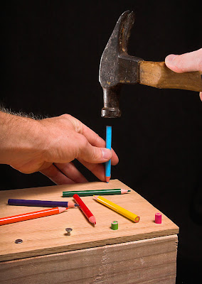
The challenge was What is this Pencil?:

Take a photo that has a pencil as its subject. However, the pencil must be used or communicated as something other than a pencil in the photo.
I was originally going to do something with pencils as chopsticks, but thank God I didn't because everyone else seemed to (and got hammered in voting because of it)! Instead, I decided to try to get across the idea of using pencils as nails since they are sharp pointy objects.

While I have no pictures of it, the hardest part of the photo was getting wood ready. After much searching of closets, I located a bunch of colored pencils that were the right size (short, like golf pencils). I'd already grabbed some wood from the scrap bin at work, so that part was easy. What wasn't easy was getting the pencils into the wood, because obviously, you can't really hammer them. I used a drill to make holes, but since a too-large hole would look fake, I had to do a lot of fiddling to get the hole diameters correct (and drill up from the bottom to make it looser). The end result was tight-fitting pencils that looked really good.

There are some key items that really make the shot pop. First, colored pencils really add an extra element to the image (I originally was thinking of yellow golf pencils, but I'm glad I couldn't find any). Leaving the extra pencils on the board was a great way to break up the space and add color too. Second, I wanted to highlight the hammer and have other nails already hammered in to get across the idea that I was only using pencils because I ran out of nails. And finally, I wanted the point of view to be as if the viewer was hammering the pencils in to draw on shared experience.

Once I had the setup right, the rest of the shoot went smoothly and I ended up with a shot very similar to what I envisioned. I have a lot of process shots from this shoot, so I'll take you through them, explaining what was changed in each shot and why. Remember, you can click on all the shots to see them larger (and click the image that started this post to see the hi-res version on Flickr).

First, the lighting, which stayed pretty similar for the whole shoot:

I wanted soft lighting because there shouldn't be any tension or darkness in a semi-humorous image like this. So I put a Sunpak 383 (1/4 power?) into the umbrella to camera upper right, and aimed the flash even higher to get a pretty high angle, almost directly above like a shop light. In the back left, there is an SB-20 (1/16 power) aimed back towards the objects to get edge separation. Notice that I used the blanket background itself as a gobo to keep light off the rest of the background. The camera was in timer mode on a tripod to leave my hands to hold things in the shot, the Sunpak was synced with an eBay trigger, and the SB-20 was synced with an optical trigger. I shot with my 20D.

First, a test photo. Note the white background (more on the switch later).

(Tamron 17-50mm f/2.8 @ 50mm, f/13, 1 sec, ISO 200)

Oops, the image blurred because I had it in aperture priority mode, not manual. I mess up camera settings often, but it is easy to hear a super-long exposure. Note also that I had to literally put my arms around the camera to get the right shooting angle. It wasn't too hard to keep my arms out of the frame, but sometimes the angle my arms came in at made me look a little awkward.

(50mm, f/16, 1/250 sec, ISO 200)

Better, but I didn't like the composition. The center-right has way too much empty space in it and the lines don't lead you into the pencil. So I tried something different...

(50mm, f/18, 1/250 sec, ISO 200)

Still not great although I like it a bit better. It'd be nice to get the second hand in there, and in this angle, I can't do it without covering the pencils. How about having the hammer come from the other side?


Nope, the shadow from my arm/hammer goes on the pencils. Not good. Back to the original idea...

Much better. Note that I switched the SB-20 to the right side to get light on my left hand and more detail in the hammer (from the left my arm would cast a very nasty shadow).

Around this time I removed the CF card from the camera and looked at the shots on the computer. I find I can catch a lot more errors when looking on the computer, especially in the background and focus problems. I'd really like to get better at catching them on camera though, or seeing background distractions in the viewfinder before I even release the shutter.

I was pretty happy with the picture above, but there were still a few things I didn't like. First, the white background doesn't really make the colors pop. The background isn't as bright as I'd like, even though I used the SB-20 to both light the background and get some rim-light on the hammer. Also, there's writing on the hammer which is distracting. I'm needed to crop that out or cover it up somehow (in basic editing, I can't clone it).

So I decided to shoot another sequence on black and see if I could do better.

(50mm, f/18, 1/250 sec, ISO 200)

Really makes the colors pop now. Although that white thing on the hammer is distracting. Also, note how the hammer head blends into the background. Take a second to think how you'd fix that before you look at the next image. Can you figure out the easy fix?

(31mm, f/25, 1/250 sec, ISO 400)

Yup, move the SB-20 back to the other side, using the edge of the blanket to keep the light off the rest of the background. Also, it isn't visible in these low-res images, but the front pencils were a little out of focus, so I decreased the aperture (and increased the ISO) to get everything in focus. I also used my thumb to cover up that white paint spot on the hammer!

The one bad part about that image is my hand looks a bit strange and cramped, so shoot again...

This was the version I ended up submitting. The one issue was my right thumb is a bit too bright and is distracting (which was commented on a few times in the challenge). So I tried again:

But couldn't make the image look natural and ran out of time. In hindsight, maybe I should have figured out a way to cover or crop out my name on the hammer handle. Anyway, I submitted the previous, and it did well, narrowly missing an honorable mention, and gave me my third-best score on DPChallenge.

Overall, I was really pleased with how it turned out. It is a really great feeling to envision something and bring it to life exactly how I wanted it.

In the hi-res version for Flickr, I made a few of the improvements I couldn't do under Basic Editing that cleaned up the image a bit:
  • Smoothed and pushed the background darker (my black blanket is textured so at hi-res it can be distracting).
  • Dropped the brightness of the thumb and removed a bit of the shine.
  • Some spot editing of color, cloning out a few little dots, etc.
Well, that's it. I hope the sequence of images is educational in terms of how my idea and shoot evolved!

Friday, November 16, 2007

Anatomy of a Photo: The Failure of a Snail


This post has been hugely delayed, mostly because I haven't taken the time to write it up.

Sometimes it is our failures that remind us how far we've come instead of our successes.

The following shoot shows one such failure. I was trying to shoot for the DPC Distance challenge and I had the idea to show a snail with a long way to go. I knew I had a ton of snails in the yard (because I see their slime trails every morning) so that part was easy. To give the idea of distance, I decided to use a wide angle and a diagonal crack leading off into the distance to highlight the idea of distance. But, even though I got the image I was looking for, it wasn't good enough and I actually identified that before I submitted, a first for me. Normally, I'd submit it anyway and then experience the shock and awe when it tanked.

First, the setup. I found a nice crack leading into a flowerbed (the snail Shangri-La). I wanted to highlight the snail with a spot of flash overpowering the sun by a stop or two, so I set up my Sunpak 383 snooted with printer paper (a piece of paper, scissors, and tape are pretty much all you need for light modification in 90% of cases). The blanket is from the picnic I had with my daughter earlier (so I didn't need to lay down on the bare concrete to get my low angle) and the item propping up the light is a toy piano bench (I just grabbed what was handy). Oh, and the orange spot is my discarded shirt (don't ask why I have an orange shirt because it makes me look like a corpse).

To get the angle and lighting right I used a grape sprig (again, left over from the picnic) as a stand in. I'd rather dry some grapes than make a raisin out of a snail unnecessarily.

The next ingredient: a snail, with a bit of water to keep him moving. Snails make pretty easy subjects; even when they run you don't have to move your setup very fast. Aside: turns out the common garden snails found all over California are actually French escargot snails -- some idiot introduced them to the area in the 1850's so he could have the slimy delicacy and they took over the place. More info (including cooking tips!) here at SFGate.


With a little bit of snail herding (and coaxing him out of his shell) he gave me the shot I desired: crawling along the crack towards the distance (34mm, F/18, 1/200s, ISO100). I shot a bunch from slightly different angles, packed up (since I was short on time and new I wasn't going to do another take) and loaded the images on the computer.

And that was when I realized the shot wasn't going to work. I tried all the ways I could think of, but with Basic Editing I couldn't get the separation between the snail and the background. Turns out the concrete has the same yellow/green/brown flecks that the snail has so I couldn't get separation based on color. Desaturating (see opening image) didn't help either because the snail blended right in with the background (darn camouflage).

Even if the snail was brought out correctly (a snooted, hard light from behind the snail to camera right would have done the trick nicely) the goal of the snail wasn't obvious at all because nothing stood out in the background (other than that flash in the upper right). But a bush with a third light on it (or in it!) would look pretty nice.

The point is, I failed in execution, but it was a big deal because I could identify why I failed BEFORE I submitted. Not only that, but brainstorming fixes was very educational!

Friday, October 26, 2007

Anatomy of a Photo: Garden Spider

It seems like I've always got posts brewing, but by the time I make some time to write a post up, it's a week later than my last post. Oh well, I guess you can expect posts about once a week now :) That being said, I have a few DPC challenge related posts and a ringlight post in various stages of the pipeline, so there's always hope.

This post is another in my Anatomy of a Photo series, which I haven't updated for 4(!) months. Yikes, almost as scary as a spider up close.

First, some background. A few weeks ago I noticed a rather large Garden Spider (Araneus diadematus, also known as a Cross Spider, cool pic here) in a plant right outside my back door. Compared to the normal daddy long legs I see around the house, garden spiders look so cool and she has a nice three-foot web that she maintains daily (I'm not really sure of the sex, so I'll say she in deference to Charlotte's Web). I took photos a few different days, and decided that I wanted to enter a picture of her in a DPC challenge. My opportunity came in the Macro VI challenge. The image I finally settled on was:


And it got a 5.75, good for 100th of 247 images in the contest. At first, I was disappointed (especially when it started the first day around a 5.2) but I'm beginning to understand why it did poorly. For one thing, there were a ton of spiders in the contest, and it didn't get much for originality. It also has some focus issues (mostly due to depth of field, more on that later) and the really cool part of the spider (the head) is really tiny.

What got me really excited about the image was the level of detail I was able to achieve with my lowly reversed Nikkor-H 50mm F/2. I was starting to get a little discouraged with the fuzziness of the images at 100% crops (not horrible, but nothing compared to my other lenses). But these came out really sharp, probably because of the flash. I still think the Nikkor-H has some problems with highlights (they seem to bleed to adjacent pixels more than they should) but that is likely because of the coatings, or lack of them, and the fact that the lens is reversed.

To give you an idea of detail, below is a 100% crop (click to see it full-size). For this image, I did apply USM to sharpen it further, but you get the idea of the quality. Realistically, you can get a super sharp image if you do a 50% crop (downsample by 50%). And seeing a spider at high res is really cool (see the 1024x807 image on Flickr).


Of course, this is an photo anatomy post, so I should describe what went into the image.

First, since I neglected to get a setup shot (oops) but I'll describe it for you. Start with a very large flowering plant (I don't know the type) with the spider's web running north-south oriented vertically. She liked to hide in a dead flower on the north side, but I often caught her in the middle of the web during or after she has caught something to eat. I did shoot the spider when she was hiding, but she has good camoflage and is hard to see, even at a 1:1 macro. So I waited until she was in the middle of the web and the sun was hitting her (around noon, camera to the west of the web, sun at upper camera right).

For some reason, she always walked on the web with her body on the west side of the web and almost always upside down! Not great for photos, especially with the position of the sun. On the day I got the picture, I saw her in the middle of the web and grabbed the camera but the lighting was horrible because her head was in shadow. Back inside to grab the flash and light-stand. I taped a diffuser (scrap of white copy paper) on the business end of my Sunpak 383 and set it up to camera lower right. Since she was always upside down, I quickly dialed in an exposure with the flash as the primary and the sun a few stops darker than the proper exposure, to get the background to drop and just give highlights and separation from the sun. This was about 1/200 seconds, ISO 400, and F/16 on the Nikkor-H (I handheld the camera since the flash stopped motion well).

Here's the result when I was shooting pretty much straight on:

I liked the image, but I couldn't get the back and the head in focus at the same time because my depth of field was less than a millimeter. So I decided to shoot upwards (rather difficult, actually, because I kept bumping the plant trying to get in there) and got something like this:


Again, I like this, although the slow shutter speed caused the ambient exposure to blur, so I kept taking shots until I got the one I liked. I really liked the diagonal tilt in the submitted photo, but I'm not wild about the background colors (darn sky!) and lack of focus on the legs. There's also a really nasty highlight on the back, which I burned a bit, but it still was distracting.

If I could do it again (and I might) I'd use two flashes to crosslight the spider and mix in some ambient too (but smaller levels). I guarantee there's another, more unique view in there too, but the plant makes it difficult to maneuver. Sadly, I don't have the heart to actually take her off her web and put her in a more controlled environment. Sad, but she's been out there at least a month, and I don't feel right about it.

Friday, June 22, 2007

Anatomy of a Photo: Light-Painted Lens


So I'm not updating at the rate I normally do because my parents are in town visiting and I'm a bit busier than normal. As a result, my posts this week will also be shorter than normal, although that's probably a good thing, because I tend to be long-winded (just ask my wife).

Aidan of That Photo Over There left a note on my final Canon EF 70-200mm F/4 USM Review about the light-painted image I used to start the post, so I thought I'd explain what went into the image. Aidan just started his blog but his posts are already high quality. In fact, he recently reviewed the Centon FG105D, a cheapo flash which includes an LCD and multi-flash (turns the flash into a strobe light). It can't sync with the eBay triggers though, which is definitely a problem. I'll look into it for the multi-flash capabilities alone; there are a few gimmicky pictures I'd like to try which require a strobe.

Ok, back to the lens photo. The technique used is Light Painting: the use of a moving continuous light source to illuminate the subject and/or produce light patterns on film. It was an outtake for Light Painting III at DPC that just wasn't interesting enough (I ended up submitting Dragon Dad, which had flawed execution but was conceptually good). The previous light painting challenges at DPC have some amazing images, check them out (LP1, LP2, LP3).

I didn't take a picture of the set-up with the lens in place, but it was the same set-up as the image at left (click to see larger). I covered a box and the background with a black blanket, using a book underneath the blanket to lift the subject up. The camera was placed on the tripod shown and I used the flashlight (a blue mini-mag light) with black construction paper snoots/light guides to control where the light fell. The snoot shown is a narrow angle one that I didn't actually use for the lens -- instead I used a 6" cylindrical snoot with a 3/4" diameter.

The object in the image is a little wedding statue my wife has, pictured at right. This was one of my favorite images of my outtakes; I just love the soft lighting you get from moving the light source. I've been using light painting more lately because of the increased control over the source, hardness, and direction of the light (especially useful with reflective objects).

I shot in RAW to give me some leeway in exposure. For the wedding picture, the stats are ISO 100, 20 second exposure, and f/11. For the lens picture, the stats are ISO 1600, 30 second exposure, f/20. I used ISO 1600 to allow f/20 and a huge depth of field.

I used two main tricks for the lens picture:

  1. The projected light. The projected light is not photoshopped in, it is the light cone produced by placing the snooted flashlight behind the lens (shining into the glass). To register it on the image, I taped thin blue tissue paper to a plastic spoon and moved that paper in front of the lens (along the path). I did clone out a little gap in the cone, but that was minor (and only in this image).
  2. Dual color light on the lens. So, after I traced the light cone, I removed the flashlight from behind the lens and painted the lens itself, taking care to get light in front of the lens (to show the opening) and highlighting the 70-200mm text. Then, at the last minute, I put a red gel in front of the flashlight and put some red back lighting on the lens to add a little more interest and separate it from the background.
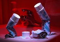
Overall, I probably did maybe 30 pictures over two days to get a lens shot I was semi-happy with. Light painting is a bit like performance art. I like it a lot, and I used the technique on my toothpaste image at right (click the image to go to the DPC page).

The best part is, light painting doesn't require any expensive equipment, just a flashlight, a tripod, and your camera. Make sure you use mirror lock-up (if you have it) and the self-timer (or remote release) to trigger the exposure. I also recommend getting a gel swatchbook (1 cent at B&H) -- the little gels work great for holding in front of flashlights (or taping to the front of your flashes).

And, if you do any light painting, leave a comment, I'd love to see the results!