Friday, November 30, 2007

The Shot: Take Two

My first review about The Shot got two angry comments (from the same person I suspect). Apparently the show has some critics, and while I like the show enough to keep watching, the commenter had some points. But before I get to that, I have some comments about Episode 4 (PopPhoto review) which I watched on Monday. If you haven't seen it, you may want to hold off reading this post until you have, because I may spoil some things.

The first sequence involved each shooter getting 15 minutes to shoot women beach volleyball players in action. Surprisely, I enjoyed the volleyball shoot sequence way more than the rest of the show and I really gave the replay button on my remote a lot of use (no, not to replay the volleyball players in slow motion!). I found it SUPER interesting to see how each of the contestants approached the shoot based on their backgrounds. The wedding photographer tried to find a unique view, Dean (the resident Strobist-style hardware guy) had a PW on his camera and a guy holding a flash for fill, the rock band photographer planted herself like a ficus, and the model-crazed black guy just focused on their rear ends...

The main reason I kept rewatching segments was to see where and how the contestants were shooting, and try to get an idea of how assistants were put in play too (each contestant seemed to have at least one mobile light stand assistant, often holding a reflector). I really, really wish they'd give the contestants 30 seconds to describe their lighting setup and camera settings though. The biggest problem with the show (from my photography nerd perspective) is that it glosses over the technicals. And not to mention post-processing, or lack-thereof. But, it is a reality show, and it has to appeal to the masses...

The second sequence involved a 3-D camera, which when I saw the description on my PVR, completely went over my head. But when I saw that array of cameras set up to do bullet-time (well, a 3-D photograph) I couldn't help but grin. Gotta love all that hardware! Aside: some of my friends were involved with the Stanford Multi-Camera Array, but those cameras didn't have nearly the resolution of a dSLR.

But, in the end, what the contestants did (and what they were allowed to do) was quite disappointing, amounting to just asking the models to jump on trampolines and fire off random images. Given more time (on the order of days) and the ability to plan the shot, change the set, and modify the camera orientations, you could get some awesome results. As it was, they were tasked with shooting hair but I thought the cameras were way too far away from the models to make an effective shot.

Sadly, I am also starting to get sucked into the reality part of the reality show (the contestants). Mostly, I'm pulling for Marie, which is odd, because I don't think she is as talented as some of the other shooters, but she seems the least warped (if I have to hear the phrase hair dance one more time in my life, I'll be driven to murder!). So, yeah, the show has pulled me in, although I suspect it hasn't done too well with the general public. I wouldn't be surprised if it was cancelled after this season, although I'm sure it is dirt-cheap to produce (especially since it is light on writers).


Now, to the comments. From Mr. Anonymous:
dumbest show ever!! FInd me photographers who want to work in teams...isn't being an artist not about being unique?? Sad very sad dumb cheap american brainlessness!
While I don't agree with a lot of it, he's got a point. The teamwork aspect of the show is kind of lame and just a thinly disguised way to increase tension and make the eliminations more dramatic. After all, how many photographers work in teams? Well, probably all of the good ones, but there's only one photographer in most cases, the rest are assistants. Hence the tension.

But Mr. Anonymous wasn't done yet. He REALLY doesn't like The Shot, so he then went back for more three minutes later with character assassination of Nigel Barker (who? I have no idea who that guy is, but I also can't remember the name of that long-hair dude that runs the show). Mr. A. did have a point later on:
The show is beyond rediculous! Hanging on a rope shooting a professional shot within 10 minutes??? why not standing on the ground shooting the guy with a long lens??
This is a good point. Nobody would ever expect to make a really good shot in 10 minutes, but it is a reality show, after all. Can't expect them to give every contestant a day and 5 assistants to get their shot. I do hope, later on in the show, they give the contestants more time and resources.

Anyway, for now, I'll keep watching. But don't worry, I'm not going to review every episode!

Monday, November 26, 2007

DIY Macro Ring Flash #3: Usage

(rev Nikkor-H 50mm, f/16, 1/250s, ISO 100)

This is the final post in my series about my DIY Macro Ring Flash light modifier. I'd recommend reading the Introduction first, then the Construction, then this post. To refresh your memory, this is what I'm working with:


Depending on the shot, the lens I've used is either a Canon 50mm f/1.8 prime, Nikkor-H 50mm f/2 (reversed for approx 1:1 macro), or Tamron 17-50mm f/2.8 (above). Wherever possible, I've noted the shooting parameters. Of course, I've had a real hard time remembering what I set my flash power too, so those all have implicit question marks next to them. All were taken with a Canon 20D. And of course, click to see them larger.


Analyzing the Light:

The first step is to really analyze what sort of light I get from ring flash, and more specifically my ring light construction. As Strobist says, ringlight is a bit cliche in high fashion modeling circles. I mean how many pouty models can you really look at with that halo shadow on the wall behind them (actually, I can look at quite a few without getting tired, but...). To demonstrate the effect, I shot my trusty wedding cake topper in front of the wall (Canon 50mm, f/6.3, 1/250s, ISO100, 1/4 power). There you go... cliche ringflash shadows.

Ultimately, a ring flash is simply an area light located on the lens axis. Move it off the camera, and it is essentially a soft box with a hole in it. In the case of my macro version, the area is pretty small (maybe 6 inches in diameter). So if the ring is large compared to the subject, you get the nice soft halo shadows (due to light from each side going around the object) and the brightest part of the object is normal to (facing) the camera. Also, you get a really nice, slow, roll off of light around the subject with some wrap-around light.

But, if the ring is small and/or far away from the subject, the wrap-around light is lost and the ring light acts as an on-camera flash exactly on the lens axis. For instance, the image at left I used the ring flash as fill and it gives slightly better results than on-camera flash because the light is coming directly from the lens, not 3 inches above it. It also helps that the total area of the ring flash is much larger than an average on-camera flash which makes a more pleasing fill. (Tamron @ 20mm, f/3.2, 1/30s, ISO400, 1/2 power)

When it comes down to it though, this flash modifying contraption really isn't meant for human subjects (although it works well as fill light). It really won't give a different look than a small on-camera flash and it lacks the punch to really light up a room (the light path and diffuser eat a ton of light, something like 4-5 stops by my estimation). At 400 ISO you can get it to cover maybe 6 feet. If you are serious about getting cover of full bodies, you'll want to look at a beefy ringlight like the Strobist ring flash. My flash does work pretty well on faces though as long as you are pretty close and fill the frame (sorry, I don't have any flatterying face photos yet).

It was designed for macros, so that's what I'll discuss next.


Macro Use:

I'll admit it: I like to chase bugs and animals around the yard shooting macros. And that's why I built this thing, because it is nearly impossible to not blur a 1:1 macro at f/16 in natural light shooting handheld without going to ISO 1600 (which introduces more grain than I can safely smooth out). Plus, at a macro level, a 6-inch ring flash is a monster and gives a great wrap around look.

While I don't have many images I'm super proud of just yet, I've got a few macro examples from when I was playing around with the thing a few days ago. I'd have more, but it has gotten really cold around here lately (60s during the day, high 30s or low 40s at night) and the bugs are harder to find. Soon though!

First up, the required bee shot. Not my best (especially because I had to be inches from the thing and it was moving enough to make me nervous). In this case, I left the motor drive on and let it take a shot without the flash afterwards to show you the difference.


(reversed
Nikkor-H 50mm f/2,
1/250s, f/16, ISO 400, 1/2 power)


A few notable things. First, I'm overpowering sunlight, which was one of my goals from the beginning. The sunlight is probably two stops lower than the flash, but it still gives a nice highlight to the wings (note how the natural light image at right exhibits a bit of blur even at 1/250th!). While it takes about all the power my flash has, it is nice to know that I have the flexibility of not depending on the sun as my key light. It is still a bit tricky to find the right balance between shutter speed and flash power, mostly because of the blur at these levels.

Second, I can get the shot at f/16, which is a huge pleasure. I finally can stop struggling with the smaller depth of field that the larger apertures leave me with. Between the action-stopping power of the flash and the larger depth of field, I'm getting great sharpness from my $20 Nikkor-H. Not bad for something I made for free.

Ok, almost done. Next up, I have the lower portion of my fuschia (stamens and pistils). The real thing to note on this image is the staggering sharpness of the waterdrops in the upper left (too bad I focused slightly behind the flower) and the beautiful wrap-around light on the stamens).
(rev Nikkor-H 50mm, f/16, 1/125s, ISO 400, 1/2 power)


Finally, another nice thing about the ringflash is it lets me go mobile with higher magnification than 1:1. For instance, I slapped some extension tubes on the lens and tried to chase a few things around (ants move really fast at 2:1!). The subjects that moved slow enough were these baby snails, which are actually quite tiny. This image is almost the full frame!
(rev Nikkor-H 50mm, ~20mm extension tube, f/16, 1/125s, ISO 400, full power)


Conclusion:

Ok, hopefully by now you get what the macro ring flash adapter can do, and what it can't. Like many people hope, it isn't going to revolutionize your photography overnight, but for macro work (or a large enough ring at human-scale) it can really add a new look. Futhermore, the design is very handy; I slap it on the camera and it stays with me, leaving the camera very maneuverable (I used a little strip of scotch tape to hold it on). And if I don't want to use it, I'll turn it off and flip it out of the way with the tilt option on my Sunpak.

Yes, I'd love some more power, but for macro work, it has plenty of power (and isn't too powerful, as in the case of the bare flash at 1/16th power). Larger would be nicer too, but a larger flash will but more stress on the hot shoe and result in more light drop-off in the ring. As it is though, the paper is super light so I don't worry about hurting the flash or my 20D's shoe.

So, if you have some time, try to whip one up. Once I've spent more time with it, I might build another, more improved version. For now though, I'm quite happy and it will be just one more photography tool I keep around!


Sunday, November 25, 2007

Backlink Note

Wow, three posts in one day. Crazy.

Ever wonder why your post isn't getting an automatic backlink on another page you linked to? I did; a my recent posts haven't been getting the eyes I expected because the backlinks are missing on Strobist.

Turns out, with Blogger's backlinking system, the links are set up the first time you publish and not afterwards. So if you accidentally publish before all your links are in, save it as a draft again, and republish, Google's blog search won't rescan your post and you won't get linked up.

The easy solution is to copy your entire post into a new post and republish it, deleting the old one.

Update 12/4: Had more trouble with backlinks not working today, and I'm not really sure how I fixed it. One thing was I set the feed to 'short' so maybe my links were too far down the page. I tried remaking the page three times and it didn't seem to work. Could be a problem with blogger too, I'm not sure...

Early Rumblings of a Strobist Photo Contest

Sounds like the cool guys at Strobist might be hosting a photo contest to choose the best images in the Flickr Strobist pool with real prizes worth actual money. Well, it is still in the advertiser soliciting stage, but given the numbers Hobby suggested, I doubt he'll have trouble getting companies to donate prizes.

The full post: Strobist: Strobist Photos of the Year Contest: Call for Sponsors

I'm excited, although realistically, given the quality of the photos in the Strobist Pool, it is highly unlikely I'd have a shot at a prize. But still, a very cool thing!

And there's always DPChallenge if you feel like photo contests; although no prizes are involved.

The Shot: Mini-Review


Yeah, I know I promised my next post would be the final installment of my macro ring flash series, but I've been too lazy to finish prepping the images for the web. So sue me...

On second thought, don't; I'm too poor to make it worth your time.

So, instead I'll give you a little mini-review of The Shot, a new reality series from VH1 built around fashion photography.

When I first heard about the series on the Photo Business News & Forum, I was pretty shocked that I hadn't heard about it. After all, I'm a bit of a reality series fan (I wouldn't go so far to say junkie). I still watch the Amazing Race, Survivor XXMCI, The Apprentice, etc. but I can't tell you off the top of my head who has won each Survivor season (hmmm... Richard Hatch, some girl, some guy, at some point a guy named Ethan won it and that chick married to Boston Rob). Still, though, I enjoy reality shows and something related to photography is right up my alley.

The Shot airs on VH1 every Sunday night at 10 pm EST (and there are plenty of reruns during the week). Actually, the fact it is on VH1 is probably why I didn't hear about it; I'm too old to watch crazy spring breaks and Carlson Daly on MTV yet too young to watch VH1 and find out what Vanilla Ice is doing right now (oh crap! It looks like he is touring... in Europe). Hence, I didn't hear about this show until now.

So I used the old DVR to tape the third episode and watched it a few days ago. The show is built around the concept of wanna-be professional fashion photographers in a game to select a single photographer to get some cash and some high-profile assignments. While it isn't amazing, there was enough to please the reality show fan and photography fan in me. I'll definitely be watching a few more.

Episode 3 (summary at PopPhoto.com) was built around extreme locations. In one sequence the wanna-bes hung over a cliff and tried to shoot a climber (I was really living vicariously in that one). Then, for the real competition, they got split into two teams to take shots of supermodel Kristy Hinze underwater in a pool (did I mention living vicariously?). The main thing I got out of the episode was a respect for models; Hinze was in the water for four hours patiently taking the direction (or lack of it) from novices. She looked entirely exhausted at the end.

The actual reality stuff (you know, relationships and freakouts and stuff) bores me, but it is really cool to see what the contestants are given and how they use it: sort of a mini making-of video. I wish there was more, but it'd bore the typical viewer if they put in too much. Just seeing the equipment is really cool -- the underwater housing on the camera was a monster with a lens-cover the size of a dinner plate. Must have had a really wide zoom in it.

So, overall, I'd give the show a 7 out of 10. It could be I just saw a cool episode, but I'm interested enough to watch again. If you have the time (or the space on your TiVo) check it out!


Actually, unrelated to the review, I hate VH1's website. Too many ads, too garish, uses way too much processor time. I went to look at The Shot images (too see some of the contestants results in more detail) and the photo gallery looks like it was taken with a cell phone. C'mon guys!

Friday, November 23, 2007

DIY Macro Ring Flash #2: Construction


Time for the fun part of the DIY Macro Ring Flash: building it. The introductory post gives all the details on the background and design.

Building Materials:
  • X-ray film backing. We had a bunch of these laying around, but any cardboard could work (including cereal boxes). We got these years ago, but if you know someone who works at a hospital that hasn't gone completely digital, it'd be easy to get ahold of some. X-ray backing is nice because it is already white (I didn't want Captain Crunch on the side of the thing if I took it out and about) and the waxy finish should wear a bit better. Even with the wax, it glues very strongly with hot glue.
  • Foil-backed tape. A reflector in a form much easier to use than standard aluminum foil. I had some lying around at work, but you can get it for a few bucks at places like home depot. Super useful if you like to build stuff for photography.
  • Hot glue gun. To stick stuff together.
  • Scotch tape. I used scotch tape for everything, especially taping light modifiers onto my flashes.
  • Office paper. I used it as a diffuser, although it probably eats more light than alternative materials.
  • Other household tools (scissors, knife, compass, ruler, pencil, etc).
My costs were $0, since I had everything around the house, but if I had to buy everything (excluding tools) it'd probably only cost $10. The main cost is time!


Construction Process:


While I had an idea of what I wanted to do, I mostly just made it up as I went along (being able to think in 3-D helps). As a result, I don't have any patterns for you, but if I do it again, I'll be sure to make a pattern. Of course, I tested as often as I could to make sure I wasn't making a mistake. Really, I just got really lucky that it all worked! All the process pictures below are clickable to see them larger.

The first step was the back wall of the modifier. I estimated the size of the ring and drew it using a compass. Then, I added the light channels (using a ruler) and left at least 1/4 inch of extra material around all the edges so I could make cut the tabs to glue it all together. Longer tabs (over an inch) act as the walls for the flash attachment. Of course, I didn't start taking pictures until after I built up some of the sides, so you don't get the pleasure of seeing the flat template.

The next step was to bend it into shape to test the fit (astonishingly perfect the first time!) and attach some of the walls, notably around the ring. Again, I just cut strips without measuring, cut tabs around the edges of the rings, and hot glued them on. The walls ended up being a little under an inch high. The hot glue works really well, at least for the X-ray film backing, but I imagine it'd work great on cereal box cardboard too. The main danger is burning your fingers, but you get used to it!

I made sure to include tabs in the triangle for the light splitter. In my opinion, splitting the light path is key to get relatively even coverage of the ring. Cutting it out was a bit tricky, not to mention gluing the wall later, but the hot glue and right angle structure of the cardboard makes the whole thing very strong and light.

Next, it was time for the front sheet. Using the back sheet as a template, I traced around it and cut out a front sheet, including tabs so I could glue it on to the walls. I left the side-walls long towards the flash attachment so I could cover the sides of the angle and left extra slack to get a nice curve at the angle too. At left, you can see the front sheet laid on top of the back sheet. For convenience, I tacked the front sheet to the back sheet with a few dots of glue, knowing I'd be able to pull it off later. The whole design and cutting process was surprisingly easy since you can measure every step of the way and nothing has to be super precise.

At right, you can see a lit side view (I slapped it on the camera and triggered it with an eBay radio trigger). Obviously, the downside of the X-ray backing is it leaks light in a bad way. That's ok though, since the foil-backed tape will both block light loss and guide it down the tube.

The business end of the flash is at left. Even with no foil and and no sides on the bend (leaking light like crazy) you can see it is passable as a ring light (although the bottom of the ring is very dark). At this point (after two hours of work) I had to wait until the next day to get the foil tape, so I shelved it and went to bed.


The next night, foil-backed tape freshly stolen from work and Amazing Race on the tube, I returned to construction.

The first step was to cover the inside of both the front and the back pieces with a layer of tape. I tried to be stingy, using as little tape as possible, but that ended up biting me later because there were some small light leaks. I recommend overlapping the tape by a millimeter, because it can pull apart slightly when the thing flexes (and it is easy to misjudge and end up a little short). The process was really easy though, since bubbles and wrinkles will not hurt your results much.

I purposely did not go all the way down the ring with the foil, since I thought it would be likely I'd want a diffuse reflector at the end to guide light out. So I glued it all together and started testing. The image at left shows the ring in action (and a light leak in the upper left that I later fixed). Note how the foiled part has much brighter hot spots but actually emits less light than the paper area. The downside is that it provides relatively uneven lighting, so a diffuser is definitely necessary.

The next step was to lay office paper on top of the ring and test again (not shown, but very similar to the final version below). The lack of foil on the bottom definitely prevented the bottom of the ring from getting enough light, so I went ahead and added foil to everything, knowing I could always go back in later and add more reflectors or diffusers. Then, I cut out a diffuser (using the same tabbing technique) and taped it on using scotch tape.

The final result gives pretty even illumination. The image at right has had no editing (you'll see my lack of quality control in cutting and taping if you view the larger version). While there are hotspots in the upper right and upper left (the ends of the light tubes) the overall ring is pretty evenly lit. The hotspots are less than a stop brighter than the darkest areas which is pretty darn good for something I built out of free materials in a couple of nights. My theory is the paper acts both as a diffuser and reflector, spreading the light evenly around the ring. Splitting the light path helps a lot too to avoid a single super hot spot at the very top, and channeling light down the ring.


Finished Result and a Few Comments:

I've got to say, the result was way more successful than I expected for the minimal time and materials I put into it (total time in construction was maybe 4 hours, but I was watching TV at the time too). Hot glue holds the cardboard very strongly and the whole thing is very sturdy (although I wouldn't let it float around in an equipment bag without more protection). The diffusion technique works quite well for the size of the ring too.

If I were to build it again, I wouldn't do much differently. The only thing I'd really want to change is reducing the sharpness of the inside angle at the main bend -- I think I lose a decent amount of light there. It might be nice to experiment with the diameter, width, and depth of the ring too. As shown above, it just barely fits around my Tamron 17-50mm F/2.8 which is a happy accident (my goal was just to get it around my Nikkor 50mm F/2).

Next post, I'll provide plenty of example images, describe the light loss from it, and talk about how I will (and when I won't) use it in the future.

Thursday, November 22, 2007

Happy Thanksgiving!


Sorry, I have no turkey pictures, so you'll have to live with a chicken vulture... err, a turkey vulture.

Enjoy the holiday!

Wednesday, November 21, 2007

DIY Macro Ring Flash #1: Introduction

Ok, let me start by saying I'm not nearly as original as I thought I was.

I conceived of this project about a month ago, 'designed' and built it less than a week ago, but only today did I realize how many other people thought the same thing. But that's ok; as my most ambitious DIY photography project to date (meaning it took me about 4 hours of work while catching up on reality shows on my PVR), I'm going to post it anyway!

I'm hoping that this will be useful to some of you out there. The info will be broken into multiple parts which I'll try to post in the next week (linked as I get them done):
  1. The Introduction, Research, and Design (you are here)
  2. Construction
  3. Real-World Usage

What's My Motivation?

I use my reversed Nikkor 50mm F/2 a lot for macro shots, but getting enough light on the sensor is always a problem. It really clicked for me after the spider shoot though: to get good macros I really needed to use flash.

Of course, I'm a cheap bastard, so buying a commercial ringflash (for $150+) was out of the question. Hell, I'm not even using a real macro lens yet, I'm not ready to shell out that kind of cash. So why not make my own?

My goal was to design and build a macro ring flash for minimal money that would let me shoot bugs, flowers, and animals handheld. Turns out, it cost me nothing, because I already had everything I needed.

My concept was simple: a Sunpak Super 383 Flash on camera with paper/cardboard/foil/whatever I could find to route the light down to a ring around the lens. The Sunpak is so powerful, even if I lost 90% of my light I'd still have enough oomph to light objects inches away from my lens. So I went through a mental design process in my head, jotted some things down last Saturday during proctoring (the sketch page is at right), and started construction that night. The result is the contraption at the top of this entry, without the light leaks (I chose that image because it looks cool and really illustrates how it was built and how it works.


Design

The design is super simple. With the flash facing forward, use a light tube to guide the light forward, then down to the ring around the flash. Use something shiny (like foil-backed tape) to help guide the light and reduce light loss, then spread the light evenly around the ring and place a diffuser in front of that to avoid hotspots. Sizewise, I wanted it to be as small and light as possible while still giving ring width of at least a 1/2 inch.

The advantage of this design is that it slips right on the flash, can be flipped up out of the way if needed (using the tilt motion of the Sunpak), and is light enough to be held by the hot shoe.

The real design difficulty was how to spread the light around the ring evenly and I pondered this many a night before I fell asleep. One requirement was to split the light path to come at the ring from two different directions and avoid a hot spot at the join. In the sketches above you can see I spent some time thinking about it, and I decided on the setup in the upper right with light paths joining the ring tangent to the circle. This prevented the flash from coming out too far but forced enough light down the ring to get even illumination (I hoped).

I also considered double diffusion using a variable width channel down the ring but figured that'd eat too much light and pose nasty construction problems.

And that was the sum total of my design. After making a few sketches, I decided to just build it and see where the problems were; I didn't expect it to work as well as it does right out of the gate. The sad part is I didn't even see that other people had used the same design until just today.


Those Who Came Before

I knew that others had completed single reflector ring flash adapters before, most notably Dennison Bertram (Strobist reference here, legendary picture of model Lenka here) and Jayhan. But, I thought I could bring some originality to the table by placing the modifier on the camera-mounted flash and splitting the light path to get more even illumination.

Turns out I was wrong.

Right before I started this post I looked again at the Strobist: Ring Flash Week: Intro and Resources (for the record, I was planning this project before Hobby posted his design -- gotta love his monster ringflash though). His follow up posts are here, here, here, and here. All are worth the read.

Apparently I got confused by the structure of the introduction post though and I never read the part below the toothy idiot. You know, the part about a Flickr thread soliciting ideas for a ringflash light modifier! To be built by a known company and undercut this commercial flash modifier (which is pretty much what I designed). And the thread includes ibanezrocker's design which is made using similar materials and Jay_in_Frederick's design which has the split light guides.

So apparently I'm not original.

Well, at least I came up with my ideas independently (or who knows, maybe I did read some of these things and then I forgot I had and tried to take the ideas for myself).


Either way, in the next post, I'll explain how to build a light, sturdy macro ring flash adapter for free (well, maybe not free, but I had everything I needed on hand). Last I checked, free is better than anything you have to pay for.

Oh, and to whet your appetite, I'll drop one of my test pictures below. Shouldn't be too hard for you to figure out what the object is. Hint: how do you think I watched the Amazing Race while I was building the thing?

Canon 20D, Reversed 50mm F/2, 1/160s, F/16, ISO 100
Sunpak on 1/4
(?) power

Monday, November 19, 2007

Dear Santa...

[Note: the slideshows here use flash. If it doesn't work reliably though, I'll switch it to a standard list of links. If it DOESN'T work for you, leave a comment!]

Dear Santa,

I've been pretty good this year. Unless you count that thing (which isn't illegal in all states) or that one day (which would have worked out fine if I had just figured the ballistics out correctly). Technically, I didn't permanently harm anyone this year, so I'd say I had a good year overall and deserve something more than coal.

So, this is what I want, in order of decreasing expense. I'd prefer you go higher up on the list if you can, but I understand that your elves work hard and have limited time. I omitted those items not related to photography, because after all, I've been waiting for a big screen TV forever...
  1. A nice long telephoto (400mm or greater) so I can get some decent pictures of birds (approx $1000). Doesn't have to be super fast (F/5.6 is plenty) as long as the quality and sharpness is good. But I should rule out a mirror lens; I've heard they don't work too well. I'd be happy to take a used lens in good condition, but even a used lens can cost more than $700. I've presented the lenses I like in an Amazon slide show below, but don't forget about the used market (like a Sigma AF 400mm f/5.6 HSM APO macro). And don't worry Santa, I'd let you borrow it for late night elf surveillance (trust me, you don't want to know what they do when you aren't looking).

  2. A good, fast macro lens in the telephoto range (around 100mm) (approx $500). I love doing macros so much this is definitely something I hope to get soon (or as soon as I get some money). Pretty much any of the following will do nicely, although I have a preference for the Canon, then the Tamron:
  3. A Holga 120N. Yes, a Holga. (approx $30) I've been getting a bit of nostalgia for the days of film and the little bit of time I spent in the darkroom in high school. I love the retro images these toy cameras make, even though they are technically quite crappy, and I love that they have options like a flash shoe. And, it'd be a great way to learn medium format photography and some simple film developing. And Santa, they aren't too hard to find, check: Amazon, Holgamods, B&H (probably my recommendation). I'm fully willing to do the necessary mods myself, but if you could throw in a few rolls of B&W film (and maybe a spool of color) that'd be perfect!
Thanks Santa!

Friday, November 16, 2007

Anatomy of a Photo: The Failure of a Snail


This post has been hugely delayed, mostly because I haven't taken the time to write it up.

Sometimes it is our failures that remind us how far we've come instead of our successes.

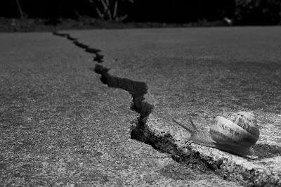
The following shoot shows one such failure. I was trying to shoot for the DPC Distance challenge and I had the idea to show a snail with a long way to go. I knew I had a ton of snails in the yard (because I see their slime trails every morning) so that part was easy. To give the idea of distance, I decided to use a wide angle and a diagonal crack leading off into the distance to highlight the idea of distance. But, even though I got the image I was looking for, it wasn't good enough and I actually identified that before I submitted, a first for me. Normally, I'd submit it anyway and then experience the shock and awe when it tanked.

First, the setup. I found a nice crack leading into a flowerbed (the snail Shangri-La). I wanted to highlight the snail with a spot of flash overpowering the sun by a stop or two, so I set up my Sunpak 383 snooted with printer paper (a piece of paper, scissors, and tape are pretty much all you need for light modification in 90% of cases). The blanket is from the picnic I had with my daughter earlier (so I didn't need to lay down on the bare concrete to get my low angle) and the item propping up the light is a toy piano bench (I just grabbed what was handy). Oh, and the orange spot is my discarded shirt (don't ask why I have an orange shirt because it makes me look like a corpse).

To get the angle and lighting right I used a grape sprig (again, left over from the picnic) as a stand in. I'd rather dry some grapes than make a raisin out of a snail unnecessarily.

The next ingredient: a snail, with a bit of water to keep him moving. Snails make pretty easy subjects; even when they run you don't have to move your setup very fast. Aside: turns out the common garden snails found all over California are actually French escargot snails -- some idiot introduced them to the area in the 1850's so he could have the slimy delicacy and they took over the place. More info (including cooking tips!) here at SFGate.


With a little bit of snail herding (and coaxing him out of his shell) he gave me the shot I desired: crawling along the crack towards the distance (34mm, F/18, 1/200s, ISO100). I shot a bunch from slightly different angles, packed up (since I was short on time and new I wasn't going to do another take) and loaded the images on the computer.

And that was when I realized the shot wasn't going to work. I tried all the ways I could think of, but with Basic Editing I couldn't get the separation between the snail and the background. Turns out the concrete has the same yellow/green/brown flecks that the snail has so I couldn't get separation based on color. Desaturating (see opening image) didn't help either because the snail blended right in with the background (darn camouflage).

Even if the snail was brought out correctly (a snooted, hard light from behind the snail to camera right would have done the trick nicely) the goal of the snail wasn't obvious at all because nothing stood out in the background (other than that flash in the upper right). But a bush with a third light on it (or in it!) would look pretty nice.

The point is, I failed in execution, but it was a big deal because I could identify why I failed BEFORE I submitted. Not only that, but brainstorming fixes was very educational!

Sunday, November 11, 2007

Hot Trends


I've talked before about the financial advantage in spotting a hot fad and monetizing a web site to take advantage. Well, turns out Google provides a nice little tool for spotting fads in a tool called Google Trends.

By leveraging the huge number of searches rolling through Google and keeping track of the frequency of popular keywords, Google Trends can highlight what is popular on the internet. Furthermore, Google even lets you link the interest (number of searches) for an item to events using news articles (like the MySpace trend that opened this post). This is a HUGE tool if you want to spot important fads as they start and try to make some advertising money off of them.

For instance, the if there's one fad that's pretty constant, it's diets:

Obviously, people use the internet to learn about diets all the time, and pretty consistently. Of course, Google must be normalizing the data based on the number of searches, to remove the influence of any growth in the number of people using (or not using) the search engine. If you look further at the graph, you'll seem some interesting trends, especially around the end of each year. Notice the sharp drop around the holidays (because everybody throws out their diet during Thanksgiving and Christmas) and the sudden upswing right after Christmas as people research their New Year's resolution!

Or, you can get more specific. How about the South Beach diet?

Looks like it isn't as popular as it used to be. But more people drop it during the holidays and pick it up afterwards though!

Google Trends is also great for comparing the popularity of things, be they Britney vs Paris (pretty much a dead heat, although Britney is currently ahead) or Chicken vs Egg (everybody knows to go with chicken). Trust me, you could build a sequence of wagers (or a drinking game) around Google Trends. Of course, this is a photography blog, so I'll leave you with the answer to the age-old question: whose lenses are the most popular? (bonus points if you can figure out where the late-year spikes come from)


If you figure out an interesting search (especially related to photography), leave a comment, I'd love to hear about it!

Thursday, November 8, 2007

Autofocus Part II: 20D Test Results


[This is a very belated follow-up to
my original post where I described how to test autofocus. More specifically, these are the results from testing my 20D.]

Test Notes:


The 20D had trouble latching on to focus even with the florescent desk lamp aimed at the paper as shown in the setup image at left. Overall, I'd say the 20D doesn't seem to acquire focus as fast and as in as low light as my 350D does, even though the 20D is supposed to have a better focusing system (one stop more sensitive, -0.5 EV vs +0.5 EV). That's just my general observation though, and I've never really tested it scientifically.

Either way, for the this auto focus test, I found it very helpful to aim a flashlight at the center of the focusing target. With the flashlight it latched on right away and didn't hunt at all.


To get the autofocus to search both ways, I held my hand in front of the lens (so it had to hunt) until it was on the extreme of the direction that I desired to test, and then let if find the focus. I also did a manual focus test, but I only really got good manual focus results if I took my time and moved the focus back and forth repeatedly. Just trying to find the focus quickly gave pretty horrible results.

The camera was mounted on a tripod of course.


Autofocus Measurements:


For the measurements, I tested my Tamron 17-50mm f2.8 at 50mm and my Canon 70-200mm f/4L USM at 200mm. Obviously, a more complete test would be nice, but I didn't want to take a lot of time to determine if there was a problem with my camera. For each lens I took three measurements for each of manual focus, autofocus from near (close focus) to the desired and from far (infinity focus) to the desired. In each case I also computed the degree of field using this DOF calculator. All measurements are in millimeters.

Canon 70-200mm F/4: 200mm, 1/25s, F/4, ISO 100
+- 7mm DOF
Manual: +2, +18, -12
From Near: +4, -2, -6
From Far: +1, -1, -3

Tamron 17-50mm F/2.8: 50mm, 1/40s, F/2.8, ISO 100
+- 7mm DOF
Manual: -17, -10, +5
From Near: -9, -11, -14
From Far: -13, -12, -13


Analysis:

For the Canon 70-200mm F/4, autofocus seems spot-on, and in fact better than I can do manually most of the time. So no problems there.

For the Tamron, autofocus gives about 1.5x degree of field, which is on the border of a miscalibration (especially since it consistently focuses too close by about 10 mm). With an F/2.8 lens, it will use the special autofocus sensors in the 20D, so it may be a slight misalignment with those. Still though, without a warranty and an obvious problem (I'd have a hell of a time explaining to SquareTrade that my measurements indicated a problem) it isn't worth pursuing. As long as I use a little more degree of field than I need in my shots, I should be fine.

My viewfinder plane calibration seems to be fine, because my manual focused images are consistent (no definite close or near focus problems).

I also tested each sensor to find the offset in my camera and verify operation, and everything was consistent with the published information. The highly scientific technique involved me drawing lines with a pen, freehand, on my target and selecting different autofocus points to see if they could acquire focus (the image that opened this post shows the pen lines). I drew both thin (one line-width) and thick (two or more passes with the pen) lines because I had some trouble finding the thin lines.

On the Tamron (which uses the enhanced sensor), it found the thin vertical line every time, but missed the horizontal thin line every time. It got the horizontal thick line though. All other sensors (the F/5.6 ones) got the thin lines every time and worked as expected. On the Canon, it was able to get all the thin lines, but of course the magnification was larger.

All sensors seemed to have the correct orientation, but the full sensor field seemed to be a bit higher than shown on the viewfinder screen (a very common alignment problem). Nothing to worry about though.

So, that's it! The whole process (and research that went into it) kind of burst my bubble about how accurate (rather, inaccurate) auto focus is, but I'm happy to know that my 20D doesn't have any major problems. I've heard so many horror stories of cameras going in for service and coming back with more problems (and the autofocus isn't fixed!).

Tuesday, November 6, 2007

Amazon Association and Adsense


I've become an Amazon associate. Actually, it adds functionality to my site, since I talk so much about equipment, now you can immediate click through to see Amazon's page including price, user comments, etc. Since I do most of my comparison shopping at Amazon, I find that super useful. They even have this nifty feature where putting your mouse over a link will pop up a picture and price quote for the item. Suppose I'm extolling the virtues of the Tamron 17-50mm F/2.8 (Canon version)... stick your mouse over the link and you'll see a picture and quote. Amazon does the hard part of generating the html code for me, all I had to do was copy and paste the HTML in and add the preview script to my template. I used this function a lot in my last post, and I'll go back and update previous posts as I have time.

Amazon also provides code for a widget that shows the image and price right in your text, like this:


(that's the Nikon version, BTW, so I don't leave anyone out). I find those quite intrusive, so I won't use them often.


In other news... I made another penny today from Adsense. Apparently you get fractions of a penny from just having the ad appear on your site, or something like that. I also did a bunch more fooling around with Adsense and added channels to track the performance of each ad (doing so in blogger isn't easy but it isn't that hard -- I got a description of how to do it from here). I also added a few referral ads to see how they work.

I'll be experimenting a lot over the next few weeks with placement, managing ads, etc. My goal is to get ads on in an unobtrusive but useful way. If you have an opinion, let me know!

I Want Fish Eyes


No, not those kind of fish eyes!

I mean a fisheye lens, which on a crop body, is pretty hard to get a hold of because you needs a focal length of 12mm or less to really get a decent field of view. Fisheye lenses are a bit of a trick lens, not something you'd want to take as your only lens to a family reunion because it'll make Uncle Bob's huge nose look even bigger. But, used appropriately, it can get images you can't get any other way, including indoor shots showing the full room (see here!) and specialty shots (here, here, here, and here). Fisheyes are also often used for scientific applications where a large field of view is required.

Note the difference between a circular fisheye (which will render the image as a circle of the frame with black around it) and a full-frame fisheye (which produces the same distortion, but covers most or all of the frame with the image). Many modern lenses with wide angles try to avoid the fish eye distortion as much as possible, but even if they don't, it is easy to remove the distortion in software (see how here).

For Canon, the options are:
  • A cheap lens attachment. Generally, these are diopters that fits on the end of your existing lens and give you a true circular fish eye. Range in price from $30-$150 (for instance, this one is $35) but I don't expect much from the optical quality. Although, I have seen some nice images using an Opteka fisheye (and a mini-review!). The images are typically really soft on the edges, but it is almost worth buying to just play with it.
  • A quality prime. Currently the Sigma 8mm f/3.5 is the only game in Canon town for an autofocus circular fisheye with a focal length smaller than 10mm. From what I have heard it is a great lens, but $600+ is a lot for something I won't use much.
  • A quality zoom. Surprisingly, these are cheaper than the Sigma prime, but they also aren't as wide. A lot of the expense of a wide angle lens is from the glassed needed to get the wide end.
  • Previous generation Nikon or Canon lenses -- expensive and super rare because 8-10mm focal lengths are extremely special purpose with a full-frame lens. Not practical at all (but I did look around!).
  • The Russian (Belarussian, actually) Peleng 8mm f/3.5. This is a surprising little gem for a completely manual lens (no autofocus or auto-aperture) available for a little under $300 on eBay. Well, good for a Russian import lens at least (great image quality, reasonable workmanship but it does it's job... like a tank). See Bert Stephani's review here, Jarnell.com's review here, and Marco Pauck's review here. DPC's lens page is here.
For now, a fish-eye lens is one of those things I want but probably won't get. There's just a ton of stuff that needs to be bought first (like food). I might consider a cheapo Opteka adapter to play with at some point, but ideally I'd get a Peleng when I have enough spare funds.

Edit: I've added a listing of Pelengs on eBay in case you are interested:


Monday, November 5, 2007

Mr Toledano

I have three posts almost complete that I'll post in the near future, but I wanted to get a link to this guy up... I love his aesthetic. And I got at least ten ideas for DPC photos by looking through his portfolio.

The link is: Mr Toledano (Phillip Toledano Photography)

He's got everything, from a spaceman with an explosion in his helmet, to a gorilla drinking tea, to empty cubic, even to car salesmen. I'd seen his videogamer series in Wired before, but the rest was quite new. Definitely worth a look, but some images NSFW.

The way I found it: Strobist -> F Stop Nov '07 -> Google Search (why no link?) -> Mr Toledano

Friday, November 2, 2007

Running This Blog: Update #3

I don't talk about it much, but one of the purposes of running this blog is just that: to see what it is like to run a blog/website/whatever. Who knows, at some point, I may have to run a website to make money. Hopefully not, though!

Google Adsense

Along those lines, I decided to try out Google Adsense. I'm getting a little under 1,000 page views a month, which isn't much, but I figure it is enough to see how Adsense works. It is really difficult to get an idea of what sort of money can be made, because Adsense is like Fight Club: the #1 rule of Adsense revenue is you don't talk about Adsense revenue. I can see why Google wants to keep stuff like that a secret (otherwise they'll get all these webmasters arguing with them over the revenue) but it is one of the few activities of Google that makes me suspicious.

Anyway, you'll notice the Adsense banner on the page (currently, I stuck it in the vertical bar to the left to not be intrusive). Hopefully they'll get me authorized in the next day or two and I'll start making my five cents a month!

Timeline/Updates:
  • Adsense application at 9:30 am
  • Application approved at 11:55 am (no real ads yet, still public service ads)
  • Logged in at 1:55pm -- the Adsense dashboard is cool! They do ask for tax info though.
  • 1:56 pm: I've got ads! They must not show ads until you put in your tax info.
  • 1:59 pm: Turns out I get ads only every once in a while, usually it's just the public service ad. They must not have enough advertisers to fill the page each time. (later: looks like if I refresh a bunch they detect that and go to PSAs)
  • Nov 5th, 4:05 pm: I got my first click and earned somewhere between 5 and 15 cents (the first rule of Adsense is...). At this rate I'll get my first check for $100 in about 10 years!


Current Status

Really, this is a follow up to my first post and my second post about running this blog. So let me get you updated.

The image that started this post shows the visits to this blog since I started with Google Analytics (click to see it larger). Surprisingly, even though I made minimal posts in August and September, traffic remained pretty steady. Broken down by source (see above) my main sources of hits are from Google and Strobist. The Google and Strobist graphs:


As you can see, Strobist drove most of my earlier traffic, but dropped off substantially when I stopped posting. But Google has pretty much taken up the slack, rising quickly and leveling off in July, then rising a bit more recently.

I haven't put much time and effort into getting readers lately, and I'm not really planning on it. But I'm starting to see what gets readers and what doesn't. You can learn a lot just looking at what search terms get to your site and which don't. I've also been getting a few hits from the other search engines, but nowhere near the volume as from Google.

Other barometers of the site's progress (because really this is just a report for myself later):
Not too great, but not too bad considering I haven't been putting a lot of effort into marketing.


If I had more time...

Now that I think about it, it could probably be reasonably profitable to choose whatever the newest fad is, stick up a site with useful information on it, and then monetize it with Adsense or affiliate programs (Amazon's affiliate program is very popular). For instance, getting in on the ground floor of a popular movement (like poker a few years ago) can get you some decent money by harnessing web searches if you are one of the first to offer legitimate content. I see two main parts of this: targeting an audience and optimizing revenue.

Targeting an audience is probably the most important: you want to be able to rapidly generate content that people will find useful and be one of the few sites that offer it so you don't get lost in all the other sites that are out there. For example, just watching Oprah and latching on to whatever she recommends could probably make you some money :) For me though, I'd have to write about something I'm already interested in, otherwise the work would be intolerably boring. But if you can get your finger on the pulse of a large group of web surfers (be it homebound housewives, bored guys at work, or photography enthusiasts), you could rapidly draw a large amount of traffic to your site.

The second part is turning the visitors you get into click-throughs on your ads and purchases in your affiliate programs. All that, without appearing TOO commercial (you know the sites I'm talking about, the ones which are just plastered with ads and maybe a tiny bit of content). Oh, and make sure they come back once they leave your site to look at something else!

Really, though, don't look here for that sort of information. A ton of good resources on managing an affiliate program, dealing with Adsense, and other tasks, just a quick Google search away!